PROJECTS
Curious Grace
Den Fair 2018
The Challenge
exhibition design that is ‘just enough’
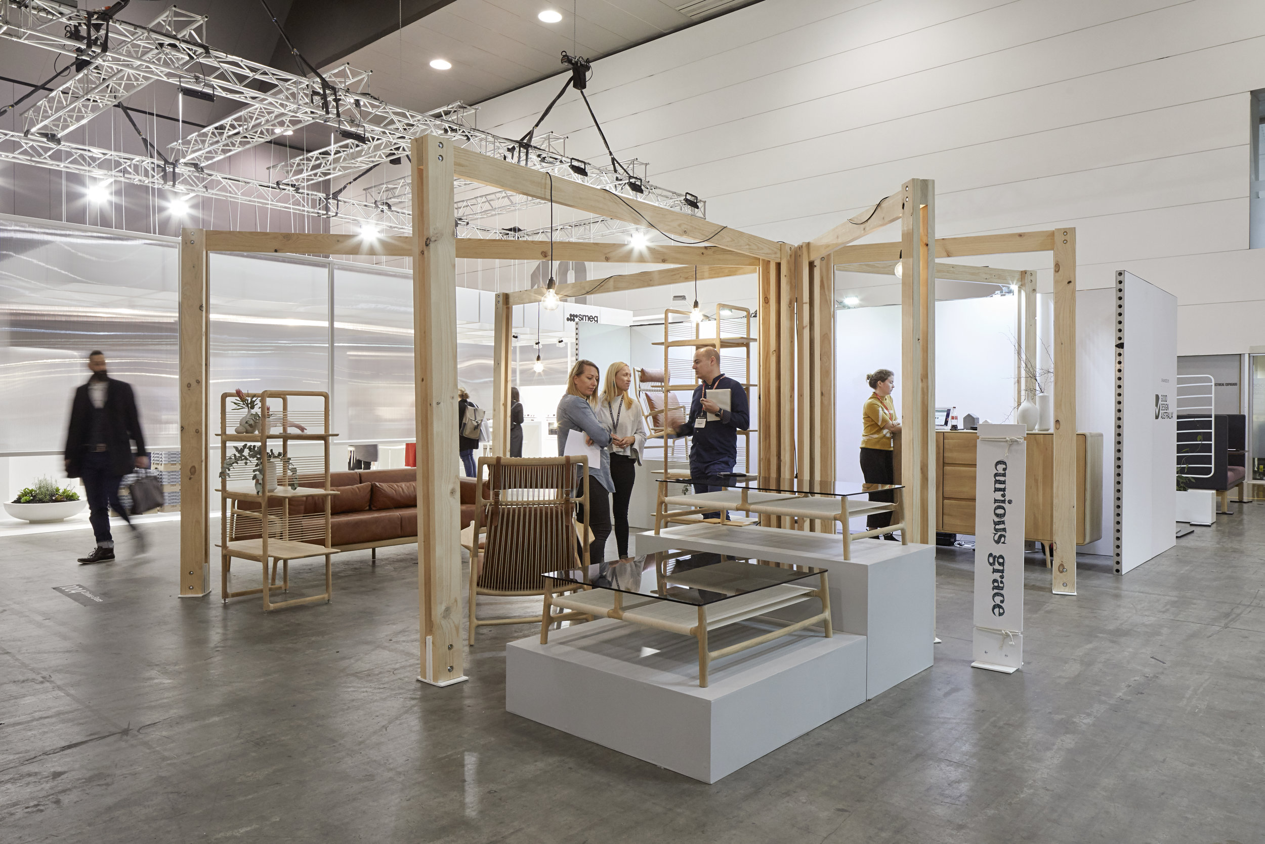
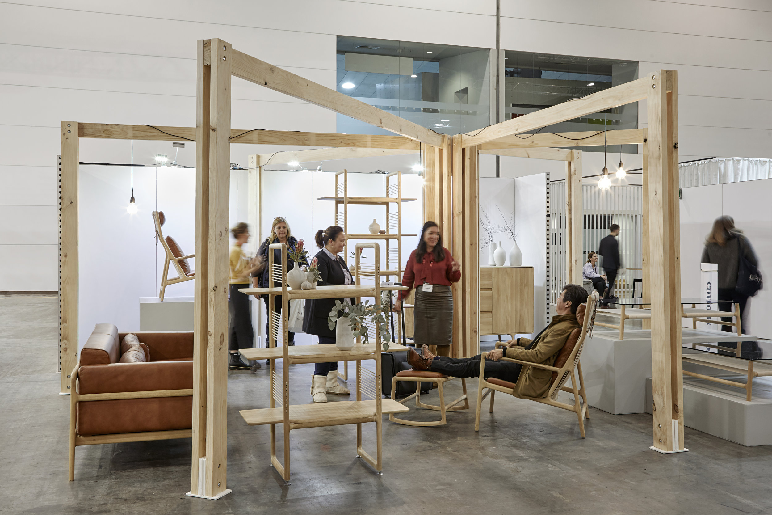
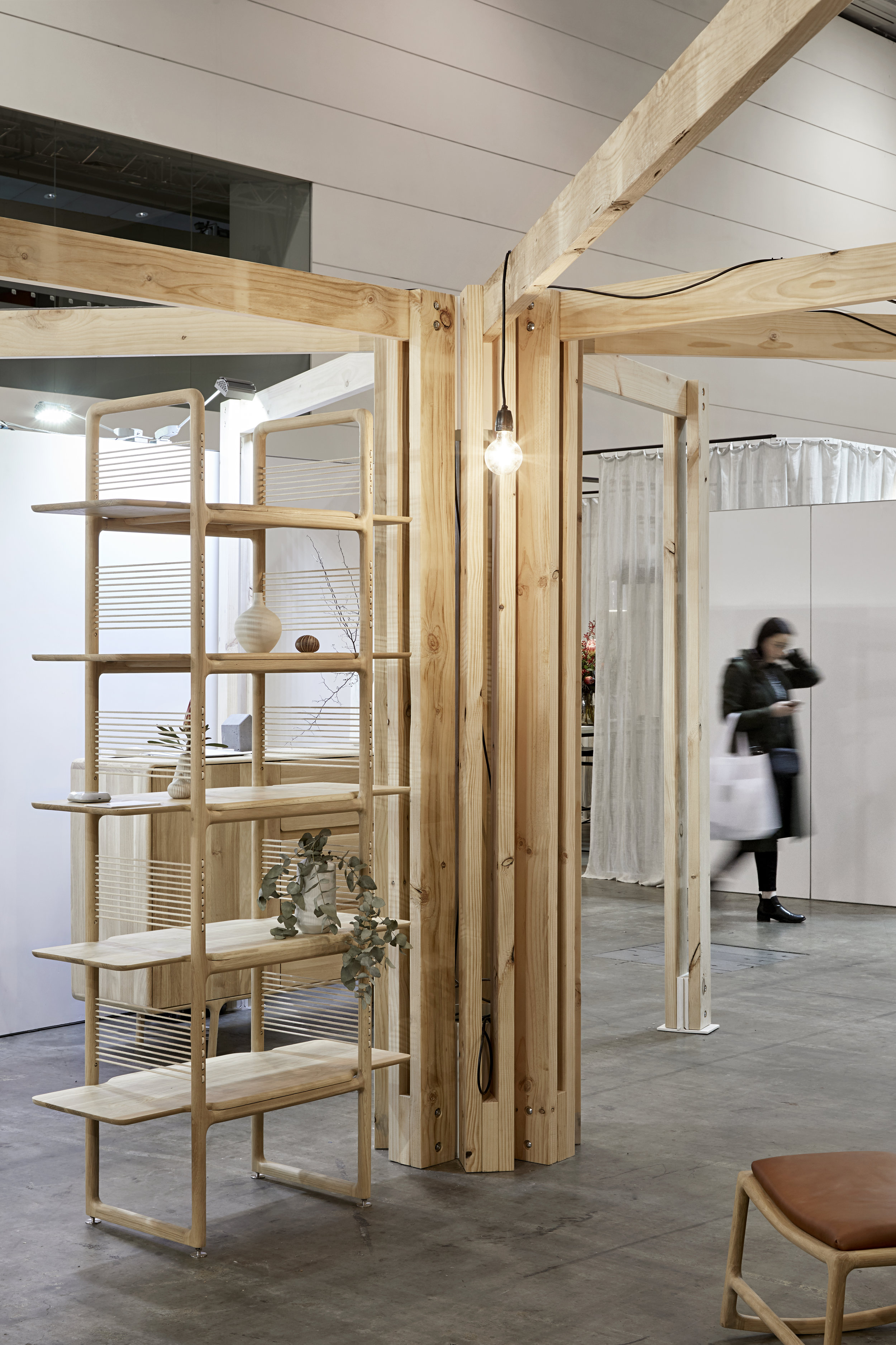
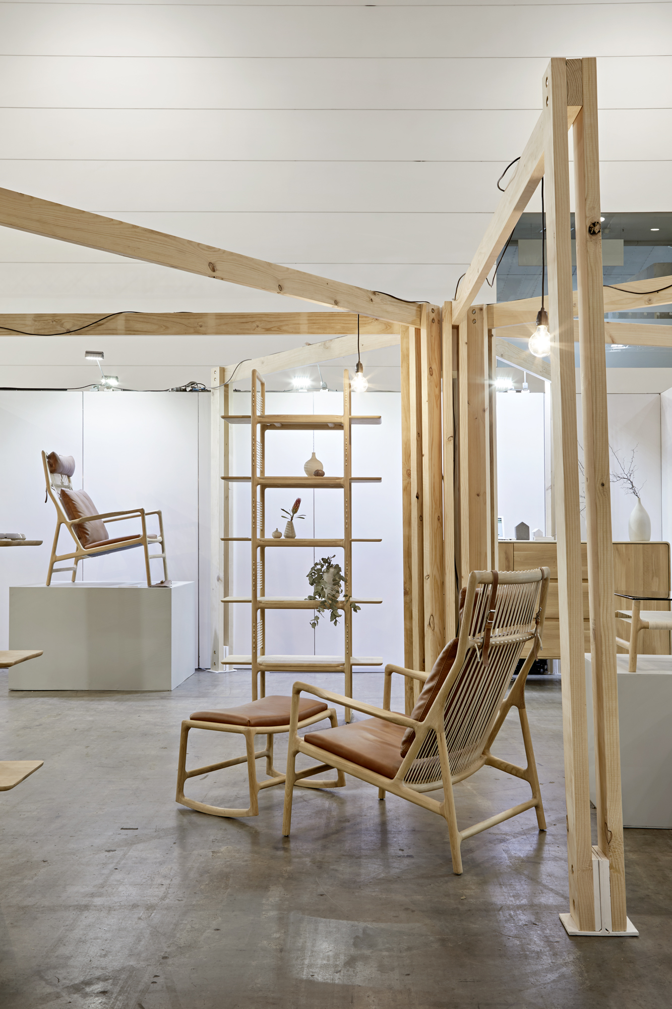
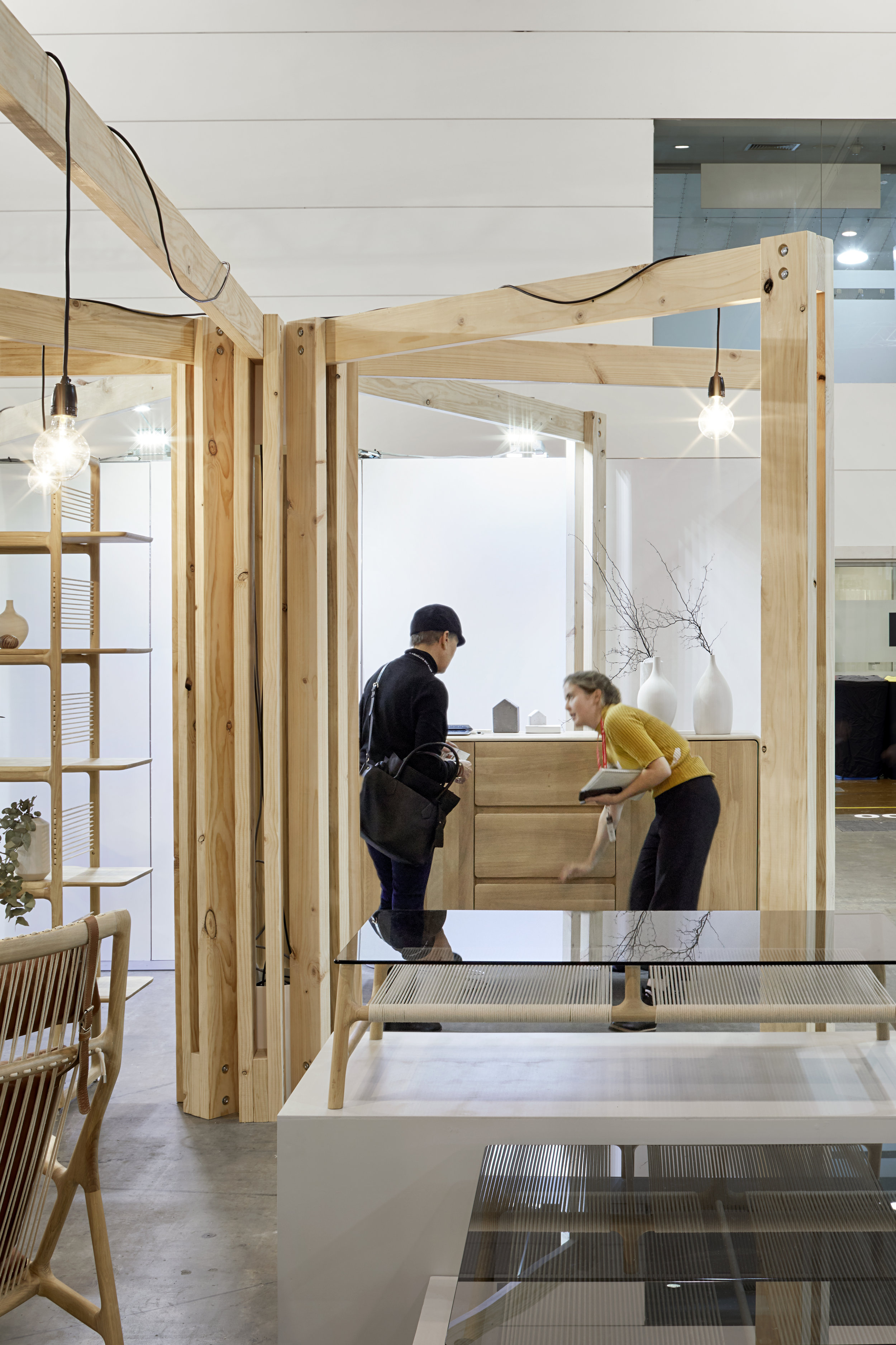
With a 6m x 6m footprint and a simple brief - introduce the new Gazzda furniture range - the possibilities were endless. Keen to tap in to the essence of the range we honed in on the fine and skeletal-like frames of the furniture as inspiration for the exhibit design. There is a lightness and a restrained quality to the range, requiring ‘just enough’ substance as is necessary, without overly intricate detailing or decoration. The string details of the chair and coffee table suggest handwoven qualities and the leather buckles express simple and vernacular techniques. The dressed pine portal frames reflect the simplicity of the furniture and the expressed connection points are similarly considered yet simple. The rectilinear frames contrast the more organic forms of the furniture. Given the temporary nature of the installation, there was a desire to be mindful of the type and quantity of material used and to minimise overall wastage. The standard profile timber members and simple bolted construction minimised production resources (as all items were ‘off the shelf’) and at the conclusion of the Fair, the installation could be disassembled and parts reused.
What if...
the enclosure was suggested rather than explicit
Tempting as it was to enclose the exhibit and lure onlookers in, it became more exciting to experiment with how little structure was required to suggest the space, rather than explicitly define it. Leaving the majority of the exhibit open enabled the pieces to be viewed from all sides, appreciated both up close and at some distance. It also created a more casual interaction with the pieces as visitors to the stand could meander through, the path or experience wasn’t prescribed or forced. The dynamic and non-prescriptive nature of the stand also allowed the exhibitors, Curious Grace, to adjust and amend their furniture layout as was appropriate.

