PROJECTS
Escher House
CANTERBURY
The Challenge
Finding ‘just enough’ space
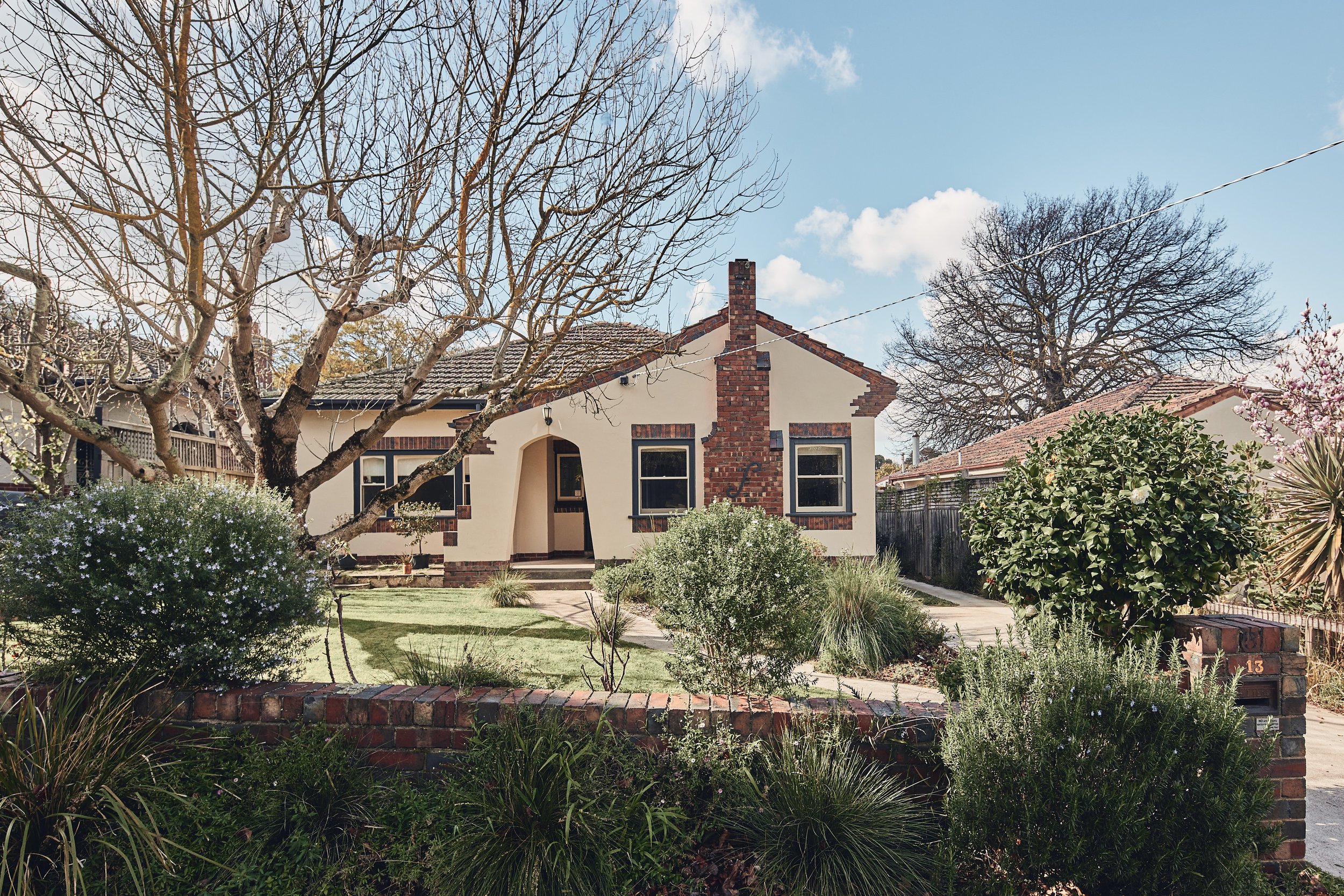
The owners of this 1930s English-cottage-style home in Canterbury had spent many years abroad and were used to high-density living in Asia. They were not after a lot of extra space, 'just enough' for their family of three and an improved connection to their backyard. But with numerous challenges including the sloping site which left the house and garden disconnected, a tight building envelope dictated by heritage controls and an ambitious brief, it would be a matter of a design response which prioritized better use of space rather than simply adding more.
What if …
We borrow, layer, overlap and intertwine spaces like a 3D puzzle?
The brief was to retain and refresh two bedrooms, formal living and dining rooms and a family bathroom in the original home and replace an existing addition with a new kitchen and meals area, master bedroom suite, study and laundry. We knew the building envelope wouldn't be able to accommodate the brief on a single level and maintain a suitable backyard, so it became imperative to look for ways to build in adaptability and ambiguity, where one space could overlap or combine with another, performing more than one function; where the value of the whole would be more than the sum of its parts.
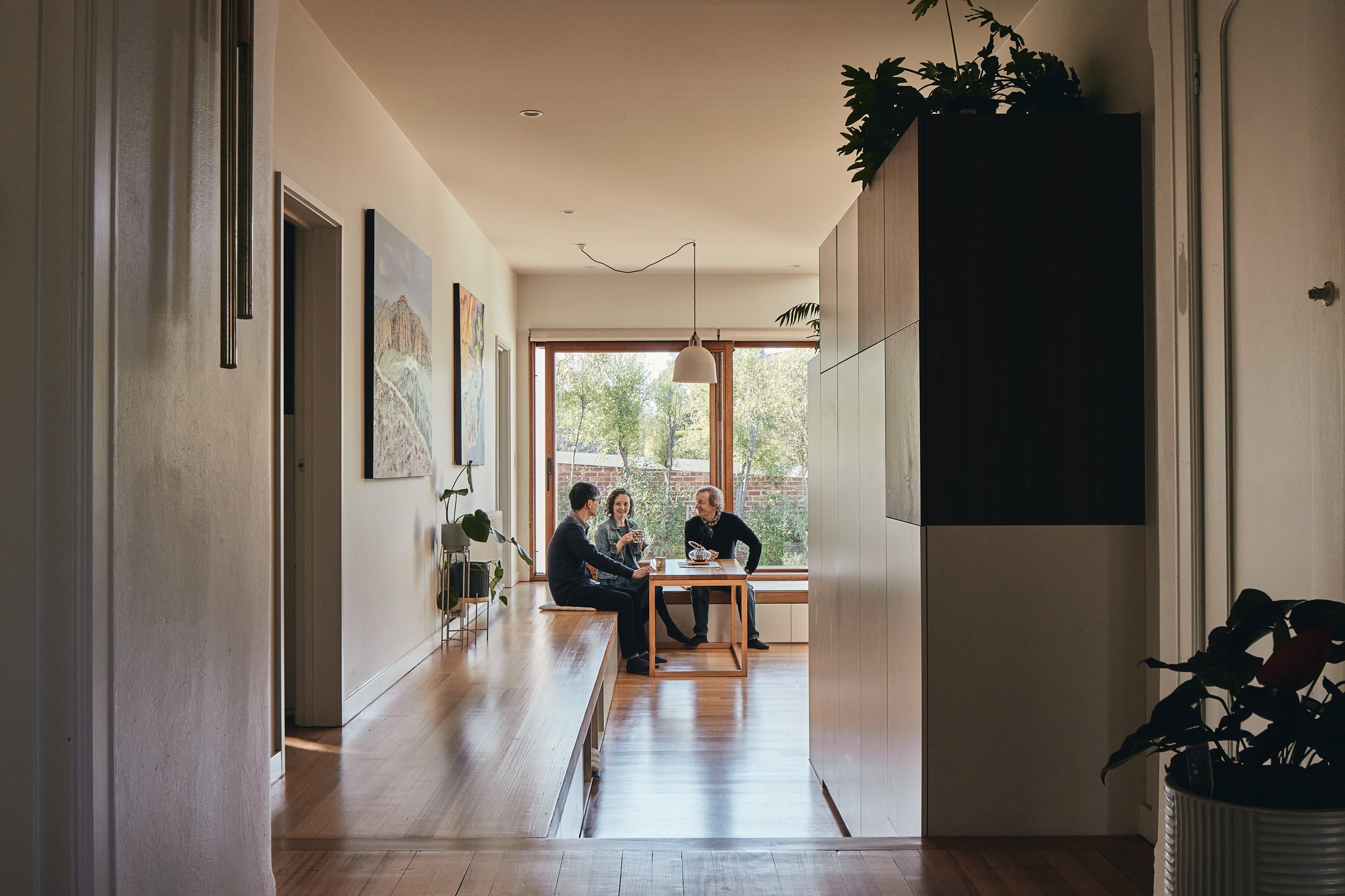
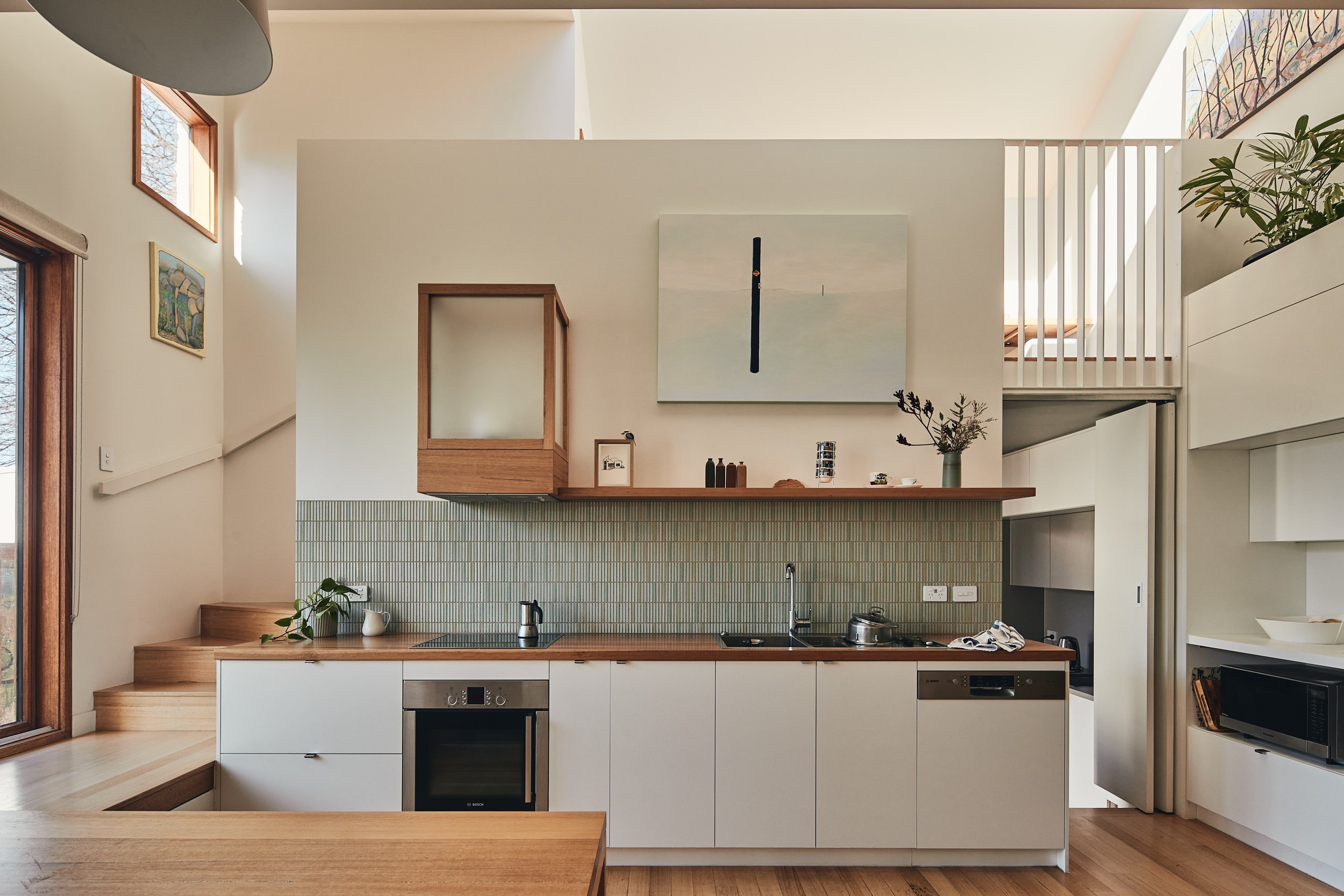
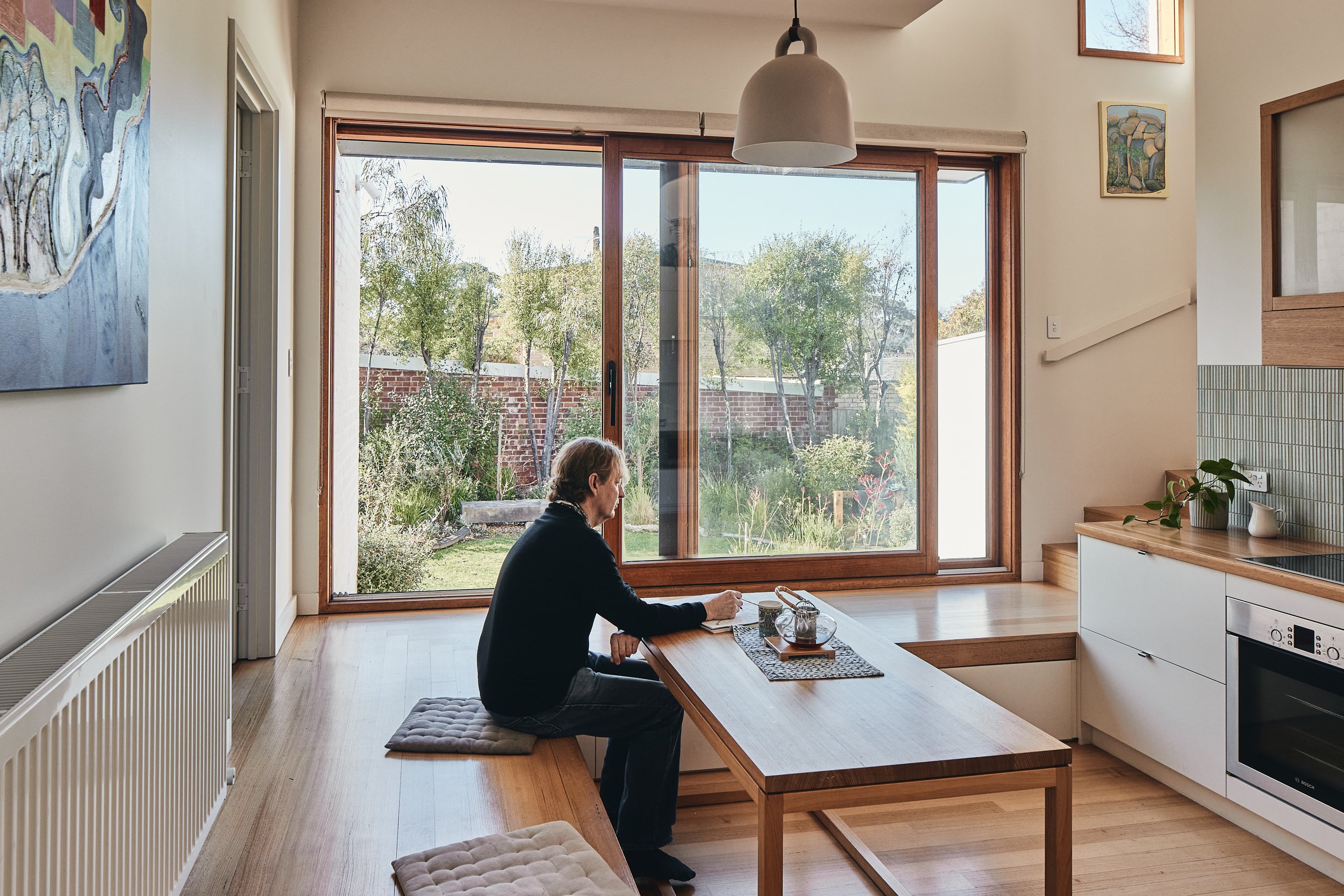
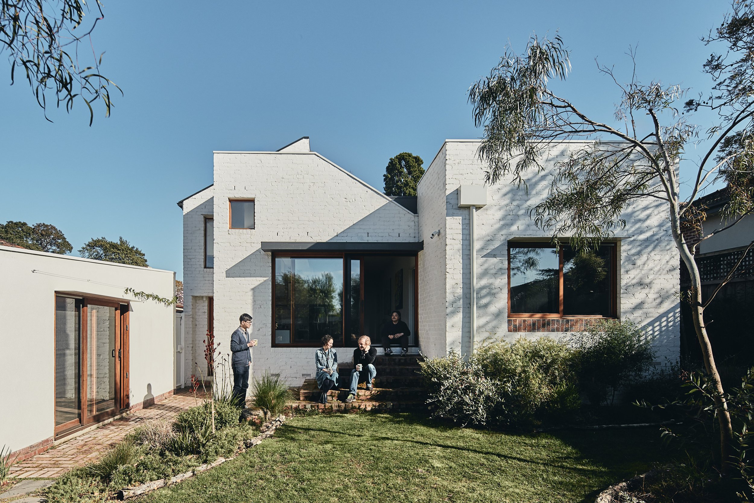
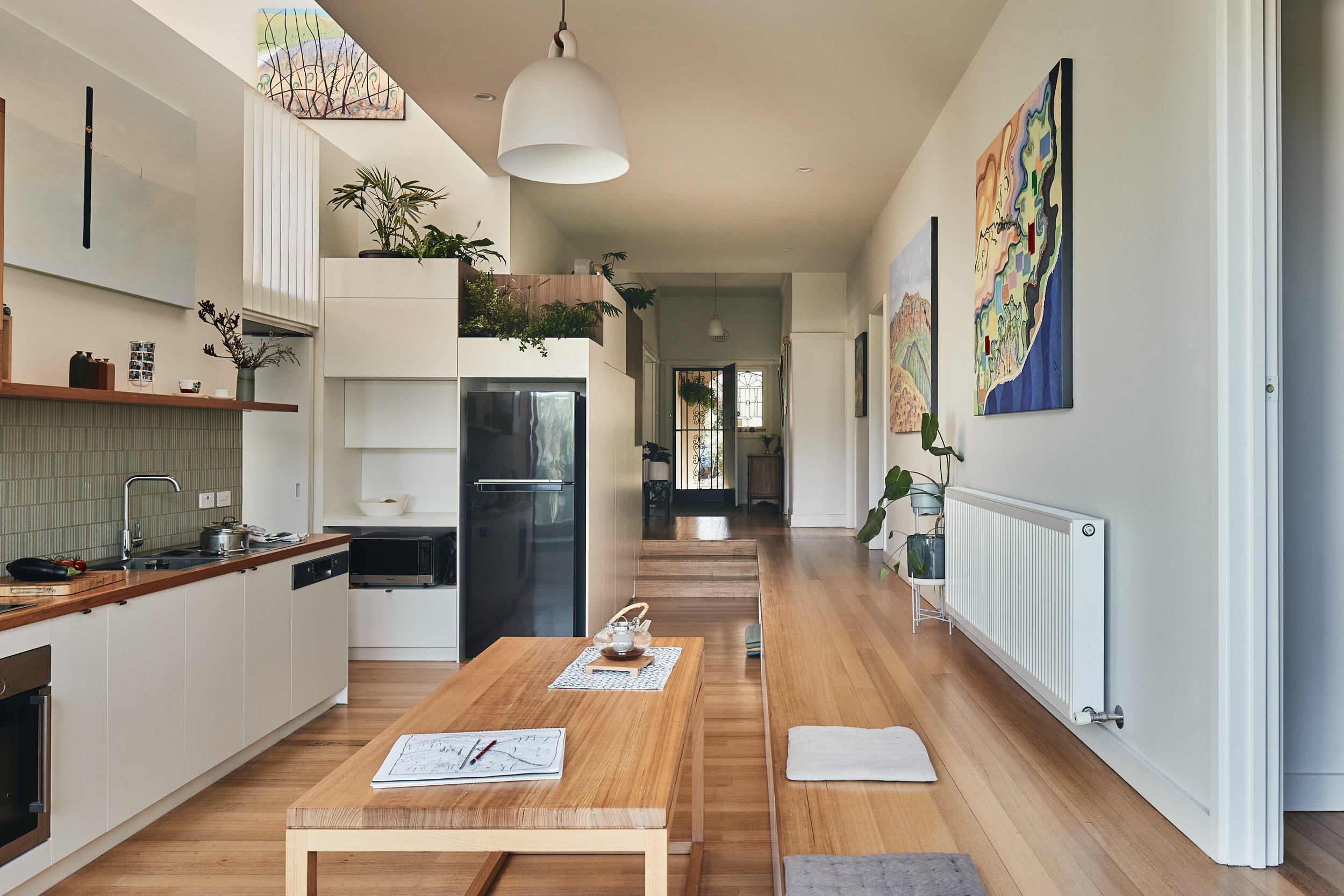
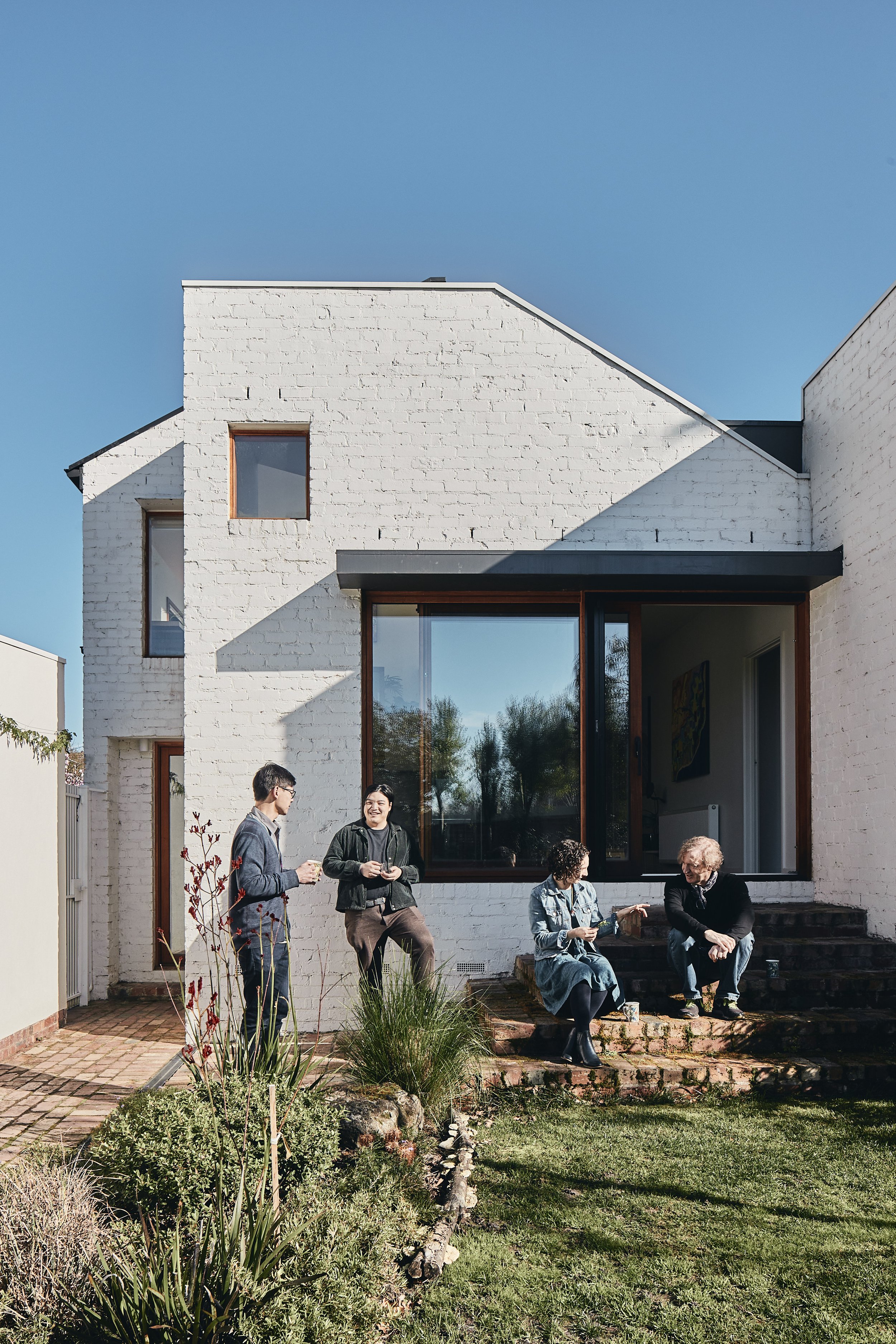
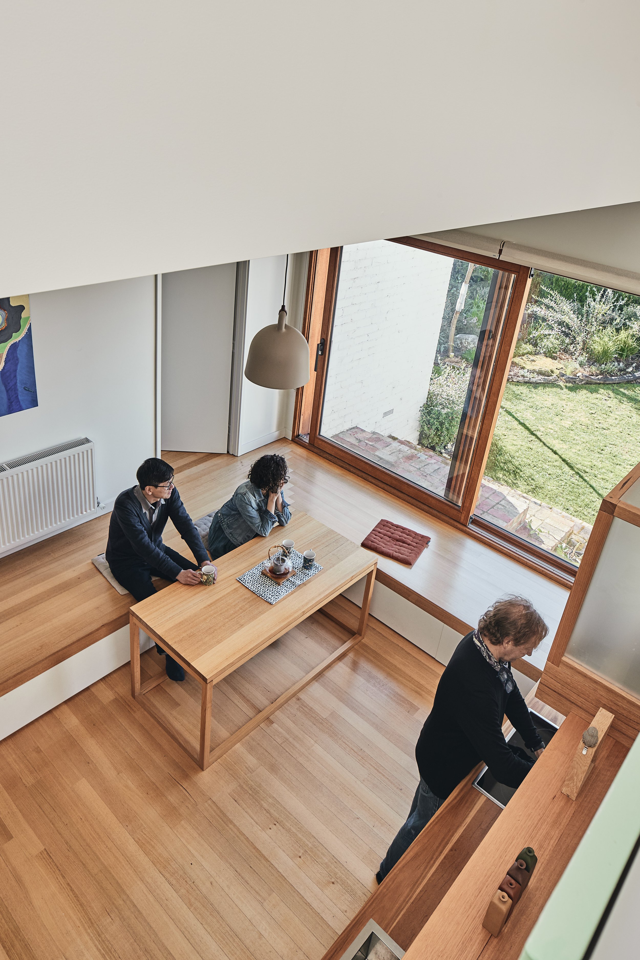
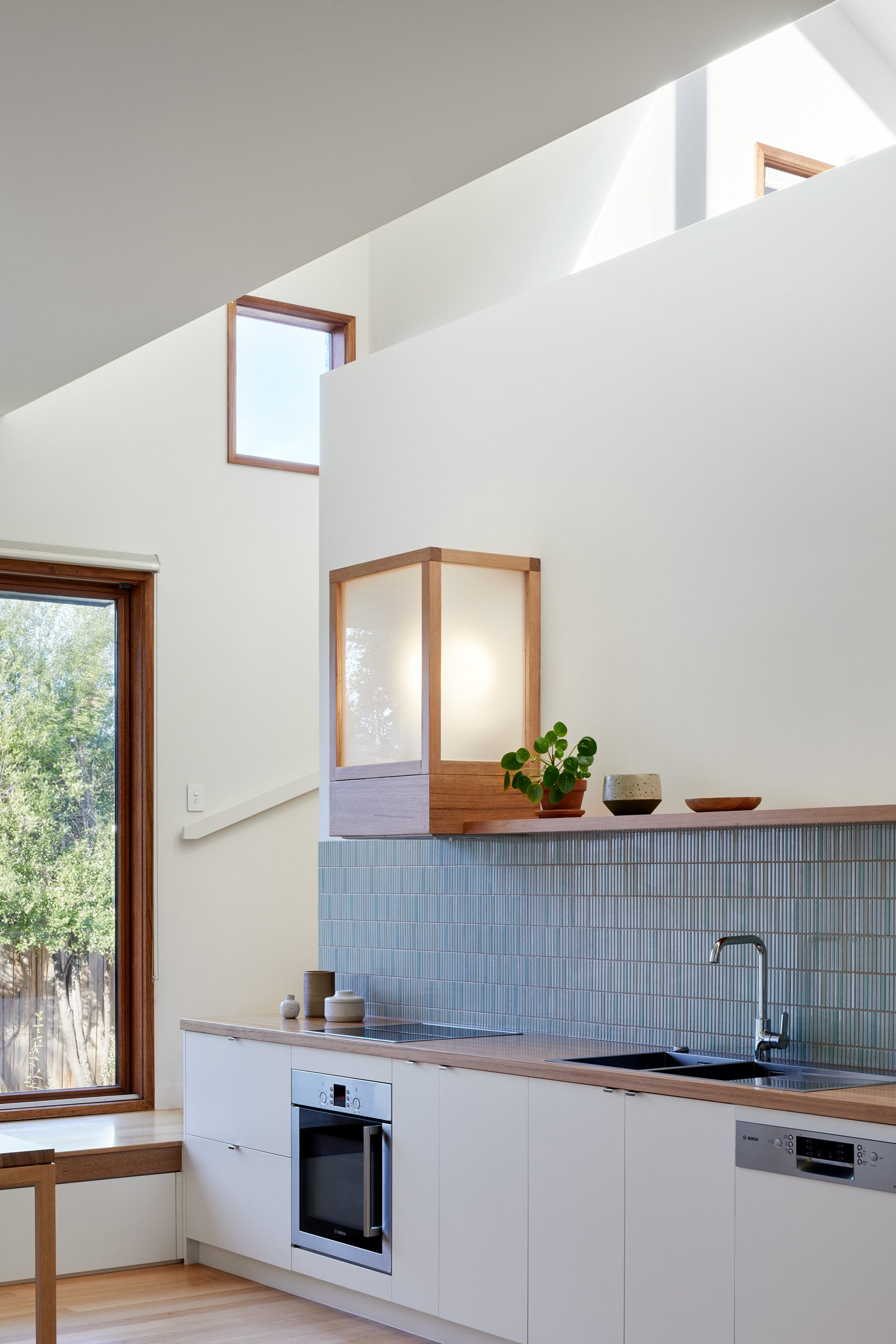
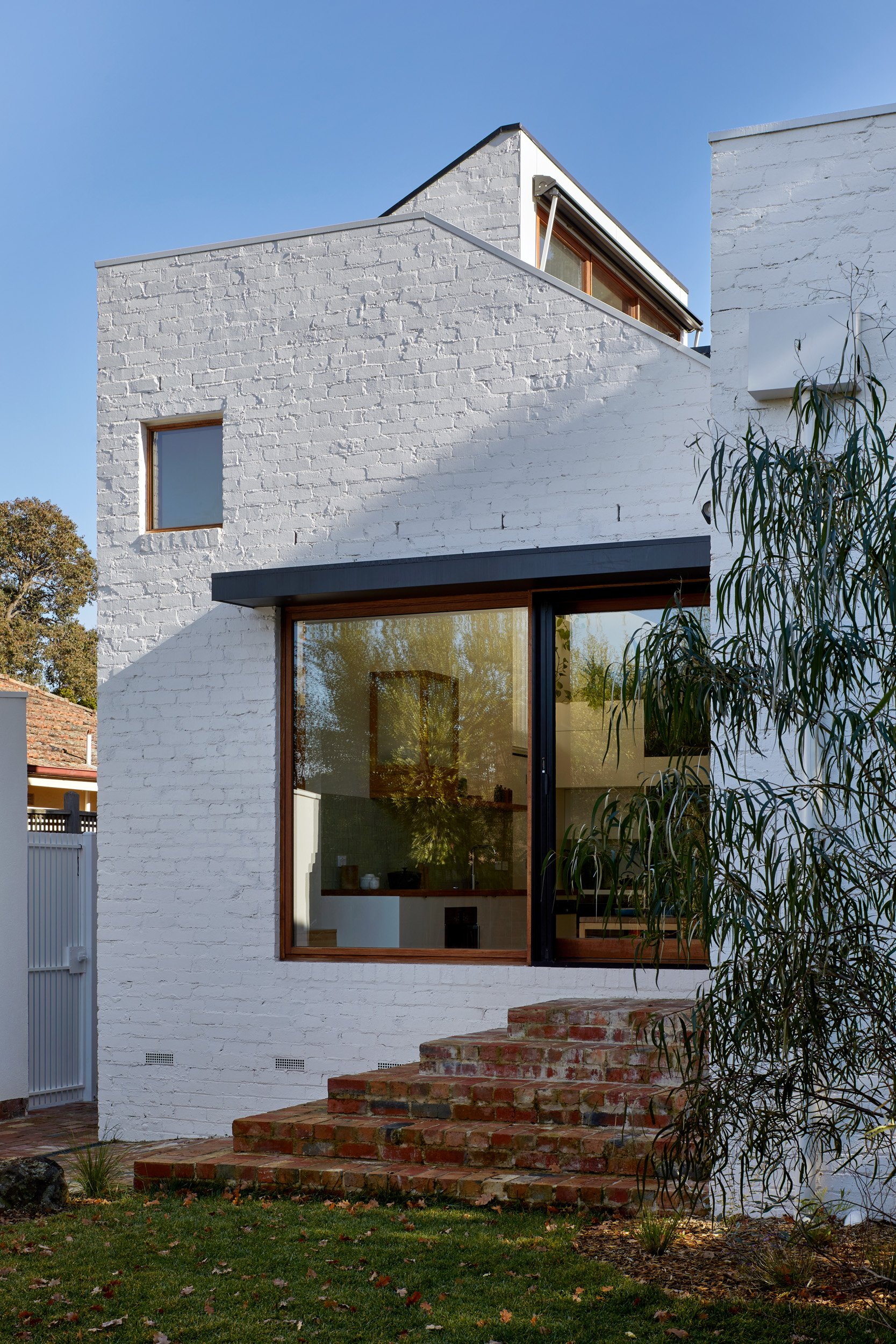
By conceiving of the addition as four split levels, we were able to overlap and share spaces, and create views through the house making each area feel larger. The kitchen is set down from the main floor level, lowering the eye and creating a closer connection to the backyard. A large sliding door opens this space to the backyard and cascading brick steps provide easy access and a sense of gradual transition between the house, the lawn and the garden beyond.
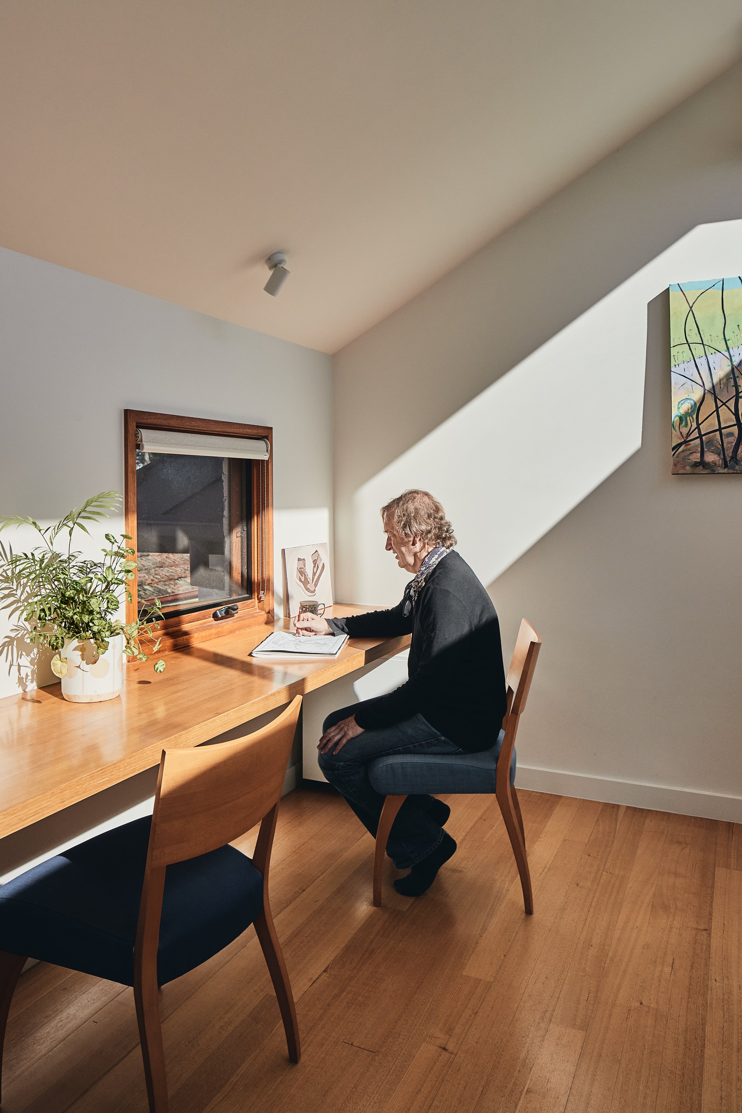
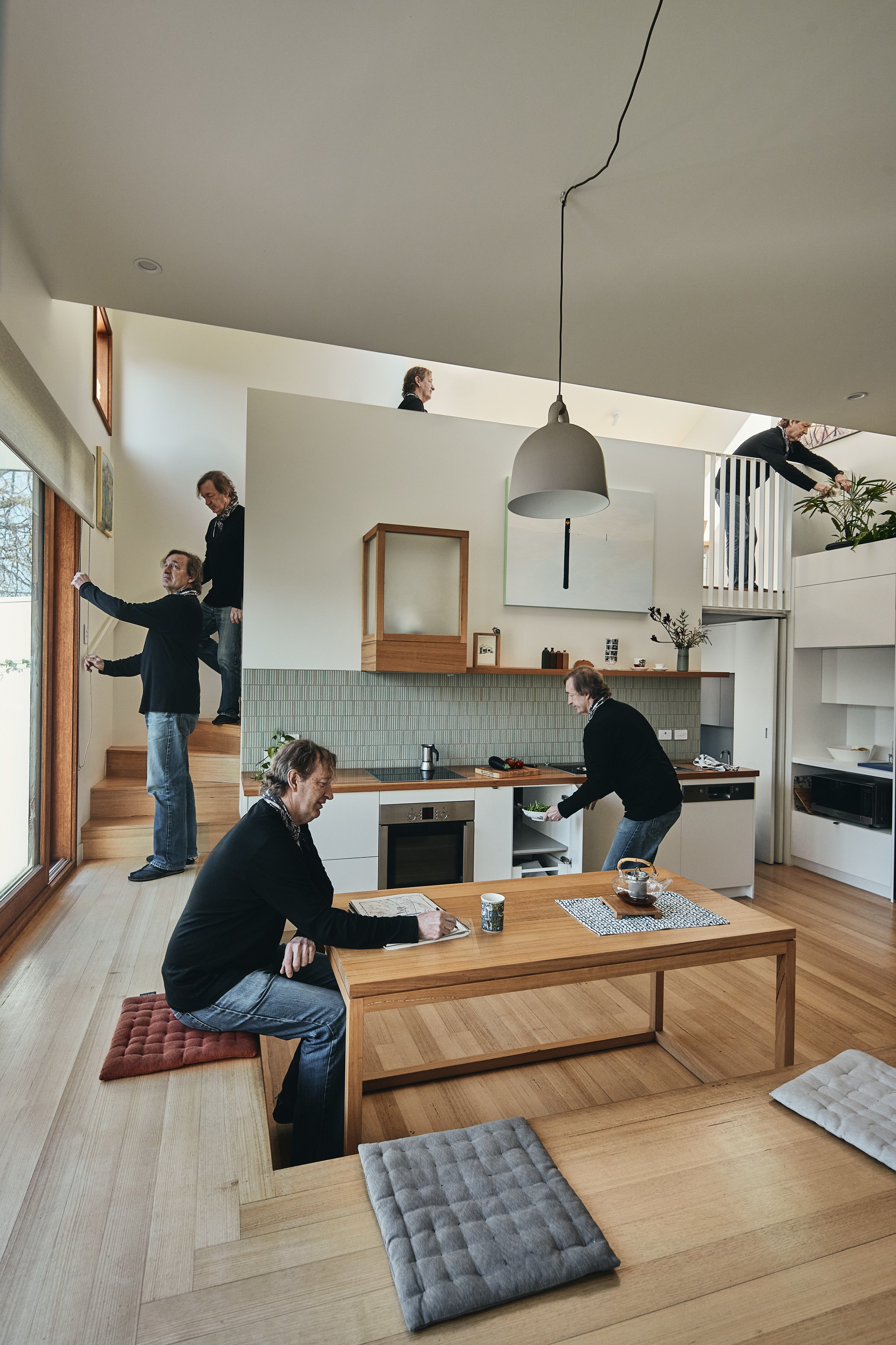
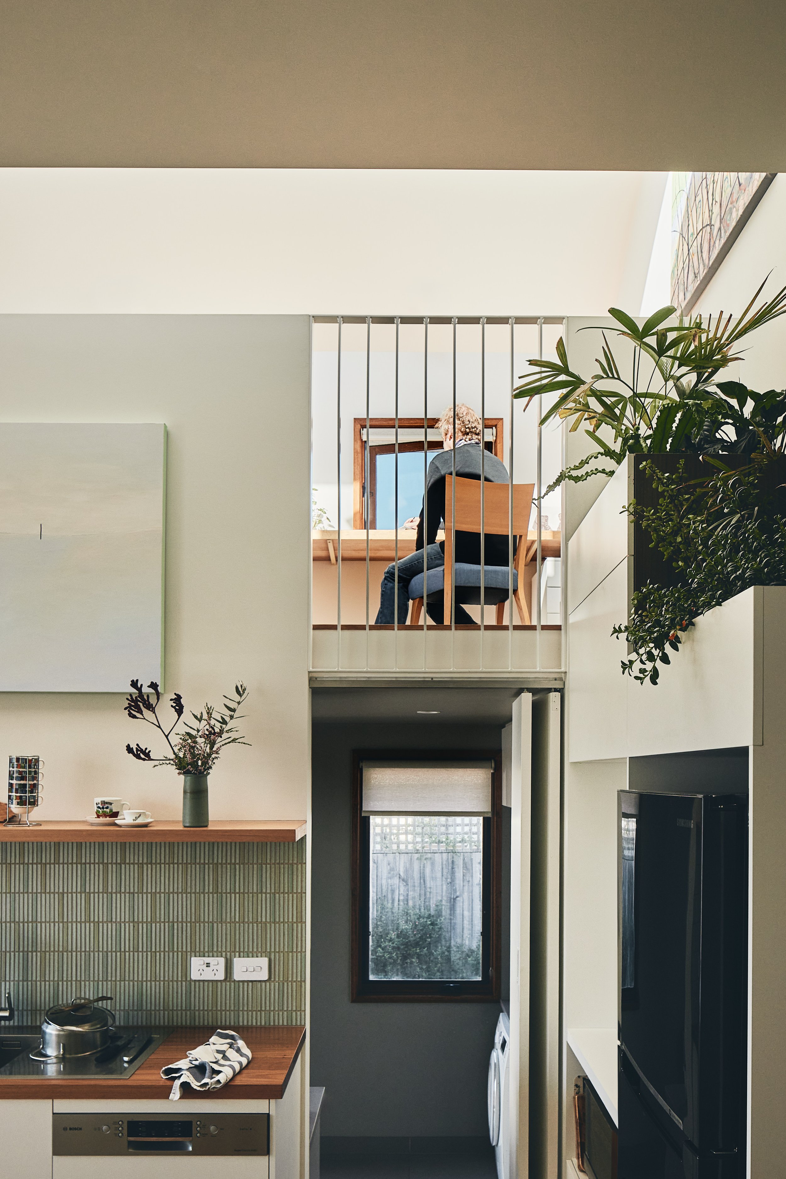
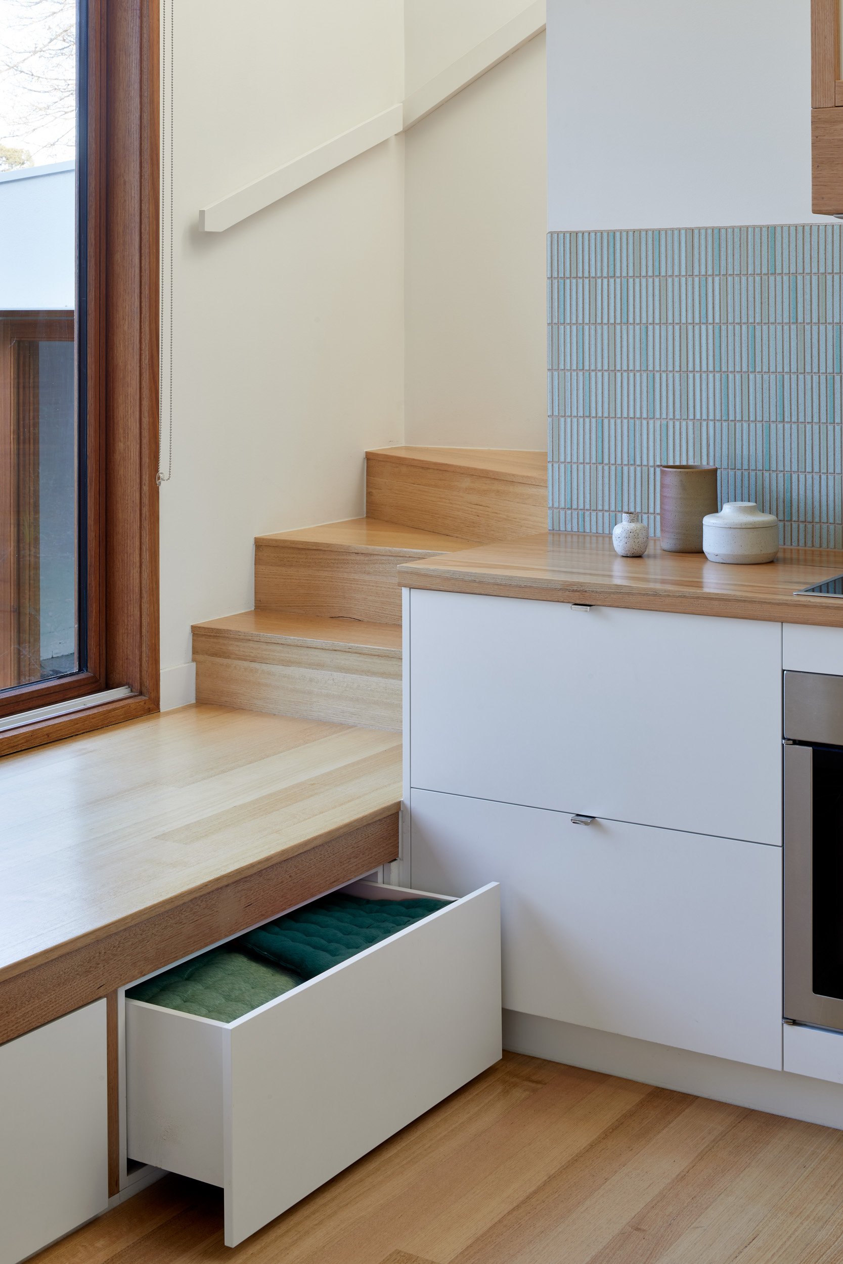
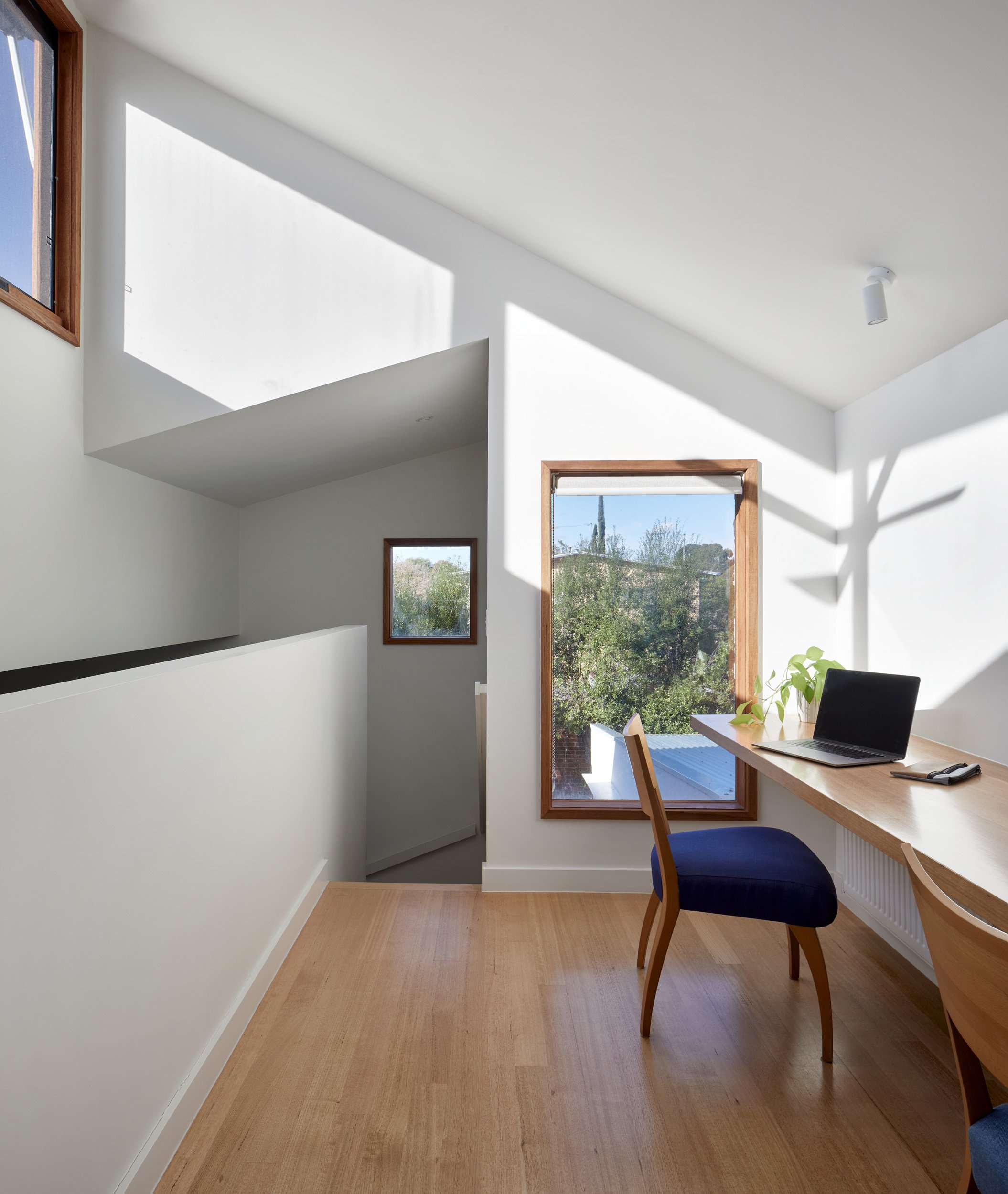
Next to the kitchen is a narrow stair leading to the mezzanine study area above. With the laundry tucked beneath it, the study overlooks the kitchen and living spaces below. Highlight windows, capitalising on the northern aspect, and a sloping ceiling bounce light into the spaces below, creating a delightful sense of light and volume. This play on levels and ambiguous functionality creates playfulness and intrigue reminiscent of an M. C. Escher drawing, creating moments of unexpected discovery and delight.
“John Liu and Steph Richardson of Inbetween Architecture have delivered us a truly remarkable and beautiful home. From the outset they took time and listened to what makes our family of three tick, our backgrounds, our interests and what we wanted from a home.”
/ owen & judy - owners /
Next-level platform
Is it a seat? Is it a walkway? Is it a cupboard?
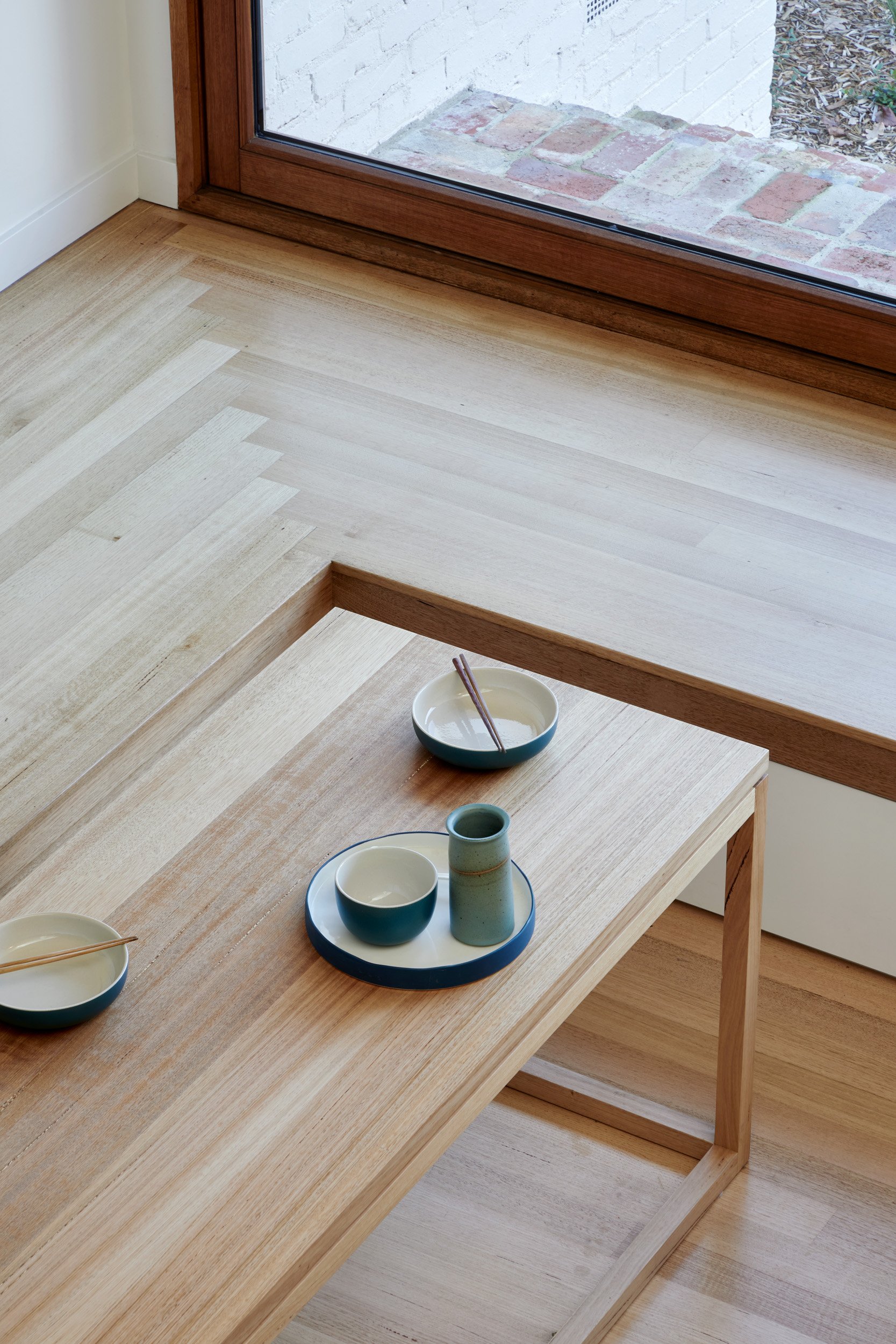
The Escher-esque ideas in the home are evident when you look at the key spatial organising element, the timber platform. An Inbetween favourite design element, it continues the existing floor level of the original house and wraps around two sides of the sunken kitchen, serving as both seating for the meals area and window seat; the perfect spot to sit down and connect with views of garden. But is it a seat, or is it a walkway? It is both, and more. Maintaining the same level as the original home, the seat also acts as a bridge connecting the bedrooms to the stair to the mezzanine study, saving precious space we could ill afford, had the stair started from the lowered kitchen level. As an added bonus, it also incorporates built-in storage, making it the ultimate over-achiever.
Balancing Efficiency with Functionality
Being strategic gives the best of both worlds
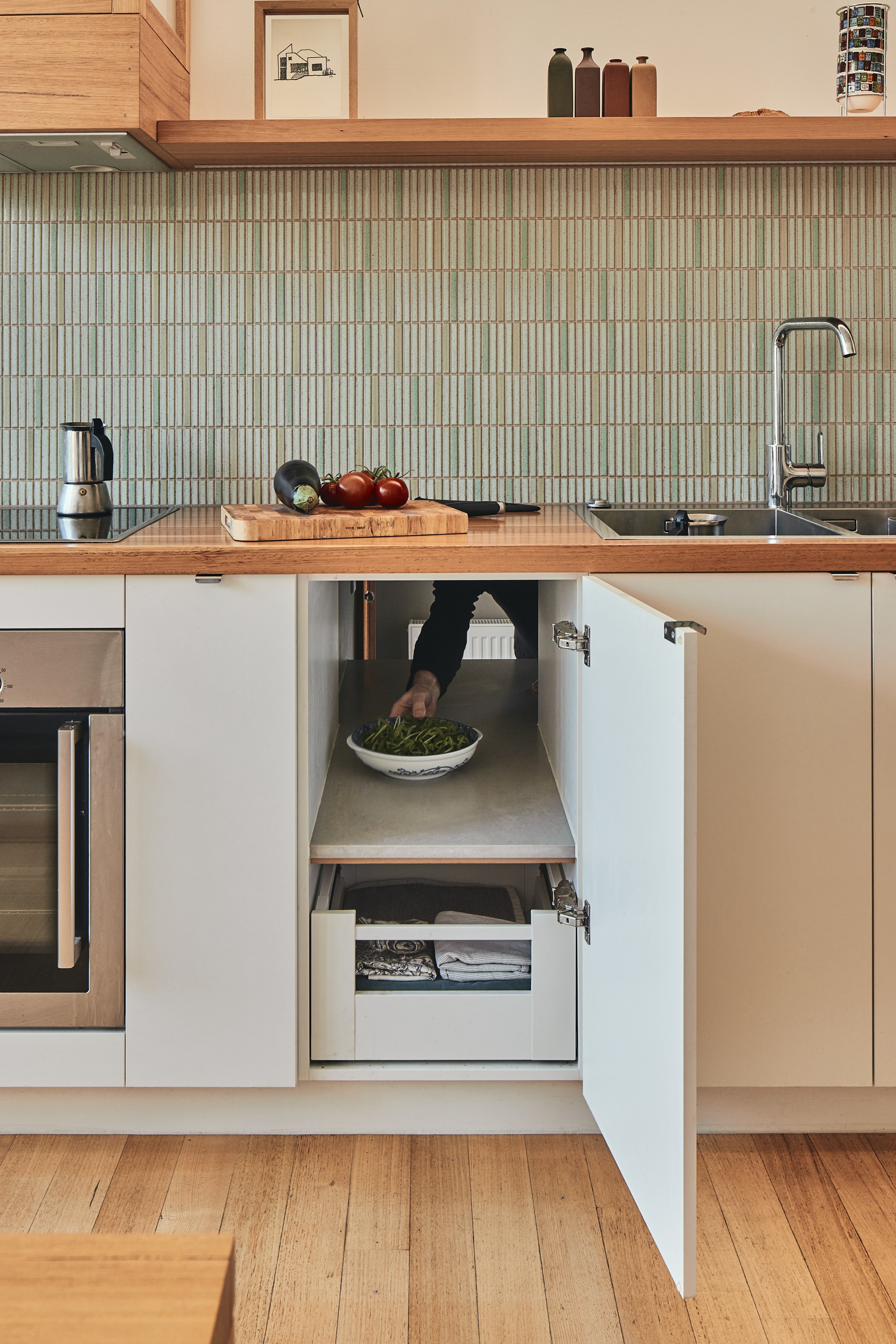
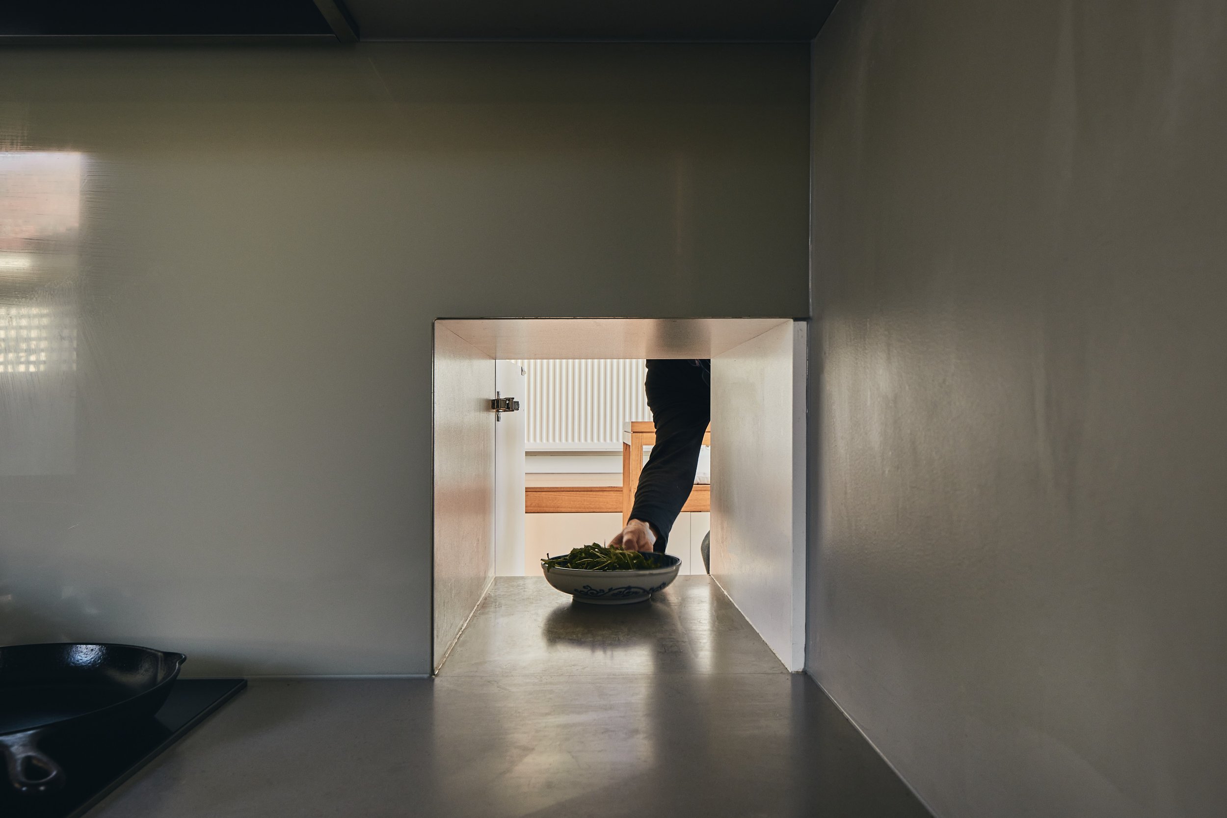
The brief had several competing demands. For example, while a key driver was to open the house up internally and to the garden, with the kitchen at the heart of this interconnected space, this was not compatible with the functional requirement of a kitchen capable of doing the heavy lifting of authentic Asian cooking. We could not accommodate a full second kitchen, so it was decided that only the necessary elements would be duplicated. A second semi-kitchen is tucked behind the main kitchen and comprises a high-powered cooktop and rangehood. At a lower level than the main kitchen, a benchtop pass-through servery links the two spaces and is concealed in a cupboard on the main kitchen side. Addressing these specific needs allowed the main kitchen to be ‘lighter’ and provided novel opportunities. A standard domestic rangehood enclosed in a custom housing, transforms into a stunning lantern, a statement light-piece and nod to the chef’s Asian heritage.
Timeless appeal
Adding a chapter - creating harmony between old and new
Looking back at the house from the garden the addition sits comfortably, as if it had always been there. The brickwork is textural and painted to complement the roughcast render of the original home while the angles of the roof line are a modern interpretation of its arts and crafts style, lending a sense of balance and timelessness to the overall design. The ambiguity and spatial surrealism of Escher's lithographs are echoed in the bold and somewhat graphic composition.
“We’ve been back in our home for 3 months and we all still marvel at the beauty of it and feel overwhelmed by the functionality of the design. It’s like we’re on a dreamy holiday. I hope I don’t wake up and find it’s not real.”
/ owen - owner /
Landscape design with historical significance
When designing the new is underpinned by memories of the past
The garden of one of the clients’ family home was designed by the late Gordon Ford, an icon and pioneer of Australian landscape design. The garden for Escher House was designed and built by Sam Cox, once an apprentice of Ford and strongly influenced by him. Sam's approach retained aspects of the existing garden including established perimeter planting to maintain privacy, whilst overlaying and inserting a new layer of Australian native planting into the foreground. The existing and new are knitted together seamlessly, echoing and reinforcing the blending established by the architectural approach. A surplus bluestone window sill from the demolition of the house has been repurposed as a garden bench seat, a poignant example of how this home and garden embrace continuity, and also a delightful place to sit, take stock and reflect on the contributions of this latest chapter.

