PROJECTS
Upside Down House
kew
Featured in Home Beautiful Magazine, Habitus Living & Herald Sun
The Challenge
more light and more family friendly space
When our clients — a young family of four — came to us, they knew they wanted two things from their existing 1970s double-brick home: more light and better use of the space. The challenge with this renovation was a sloping block and a floorplan that had living spaces on the ground floor and sleeping quarters on the upper floor, making it hard to draw light into the semi-subterranean living spaces.
What if...
We turned this one on its head?
Throughout a number of design iterations and constructive workshops with the owners, we tried numerous approaches to make the existing arrangement work, but in the end a little lateral thinking was needed. To get the most light and usable space for the living areas, it became clear that we would need to turn the whole design on its head, literally. This would be the ‘Upside Down House’.
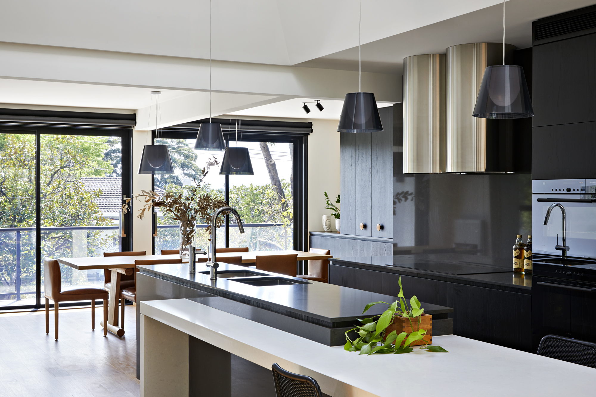
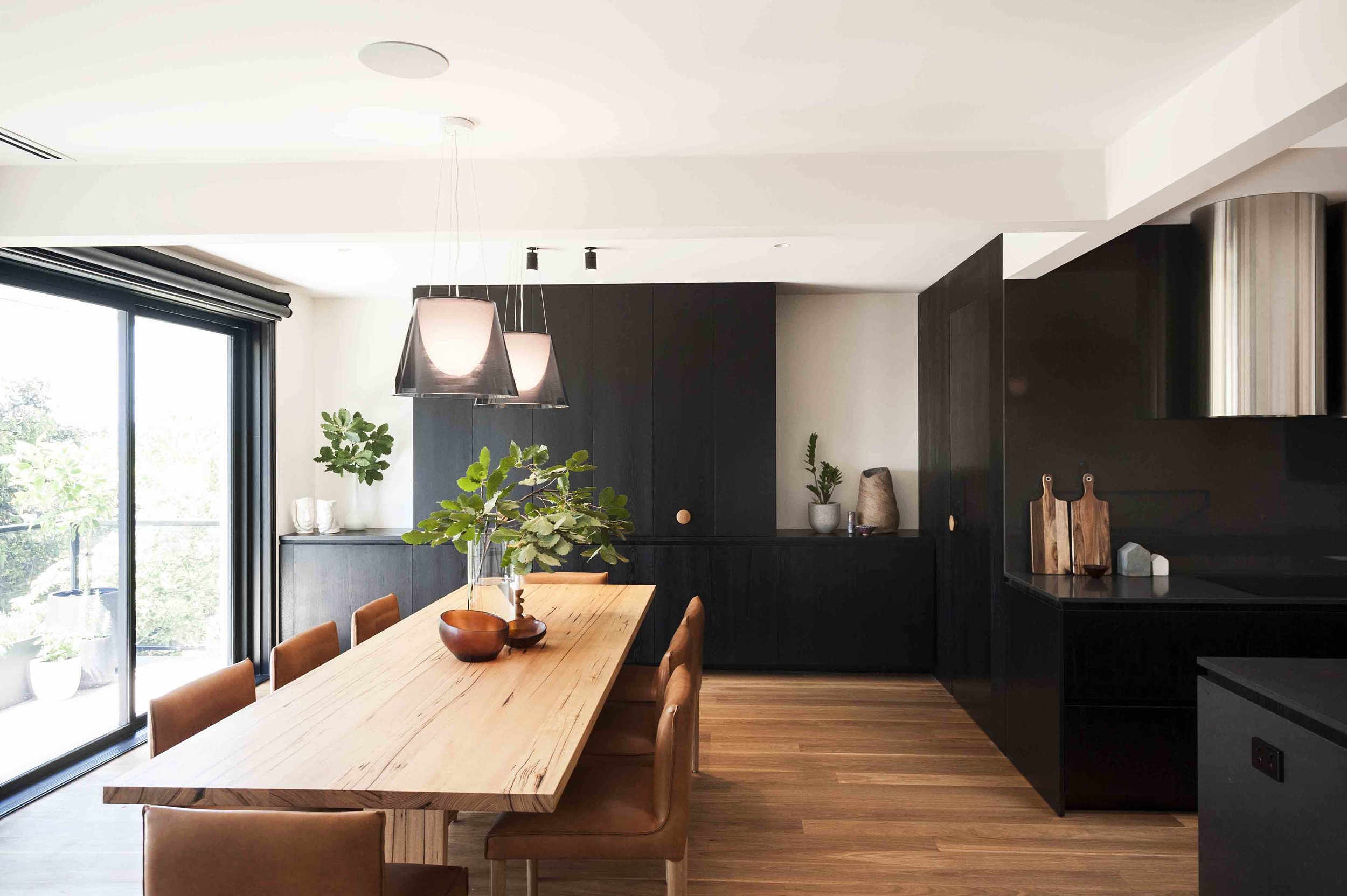
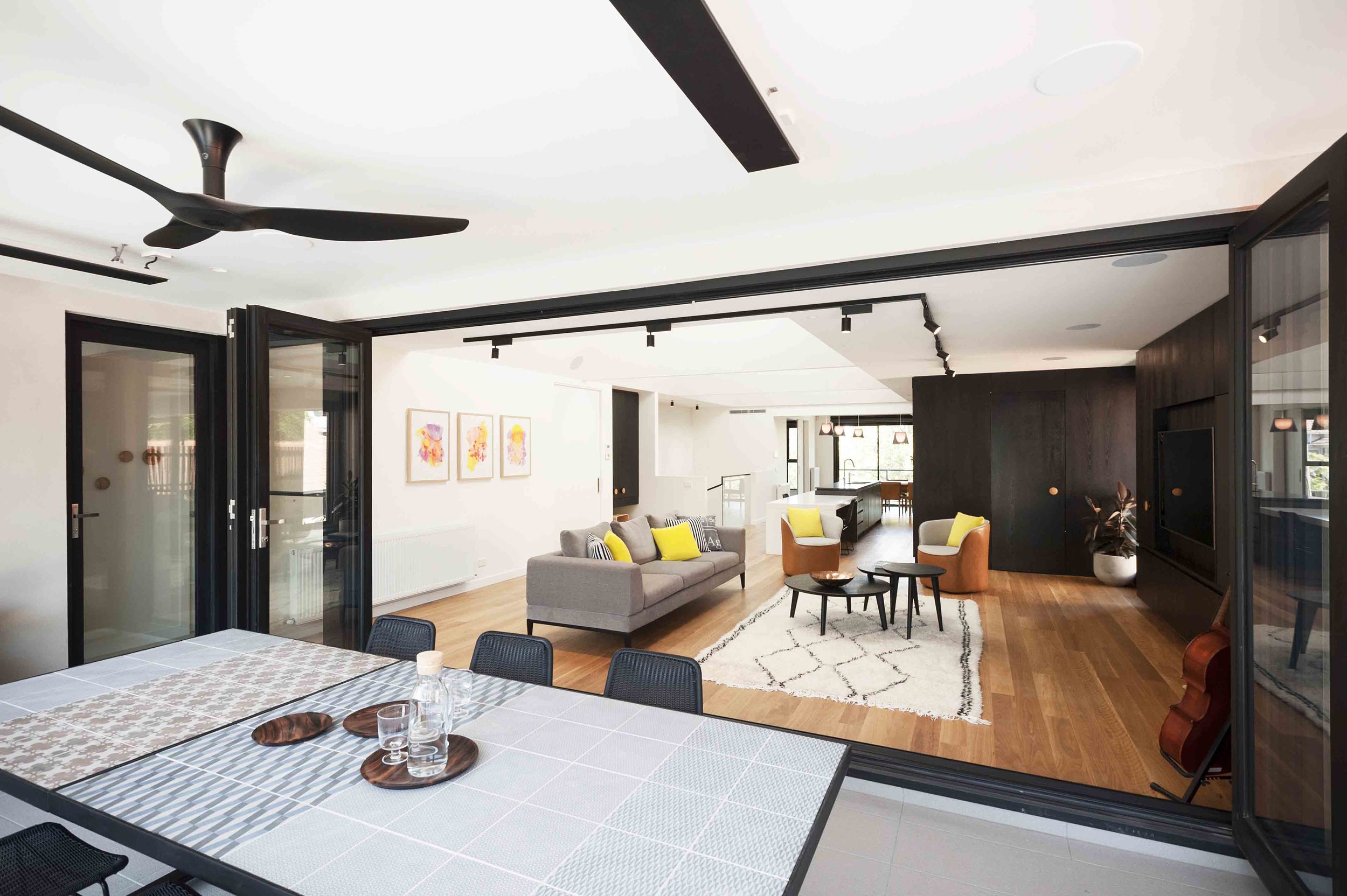
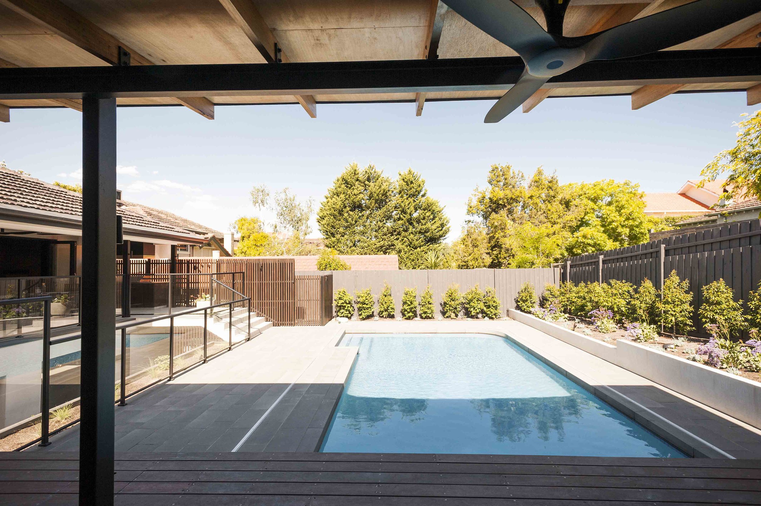
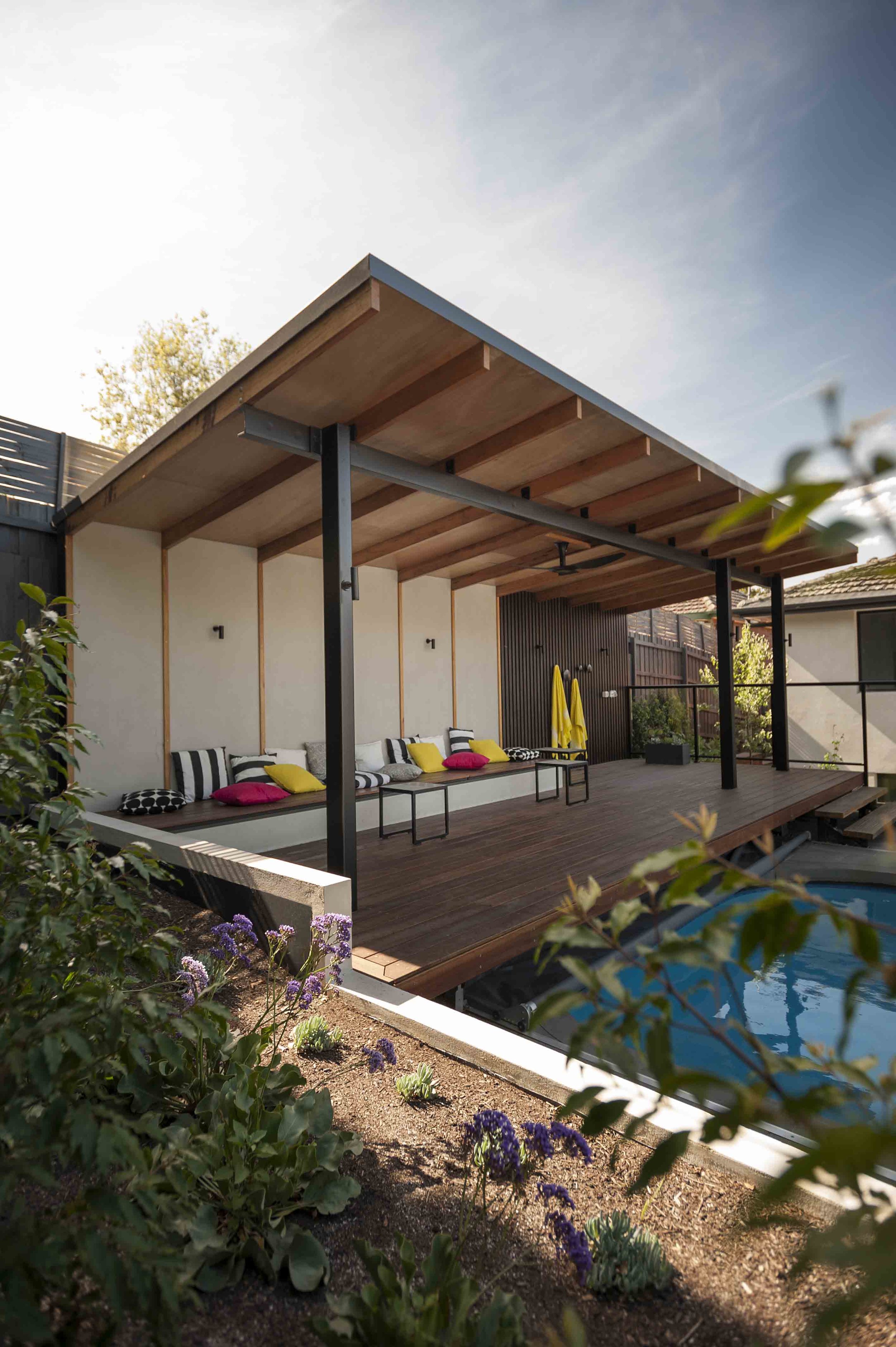
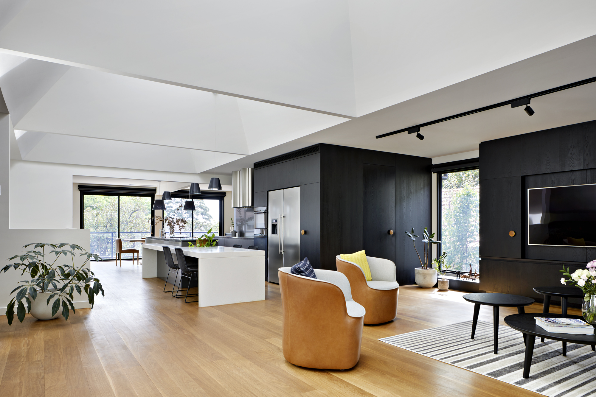
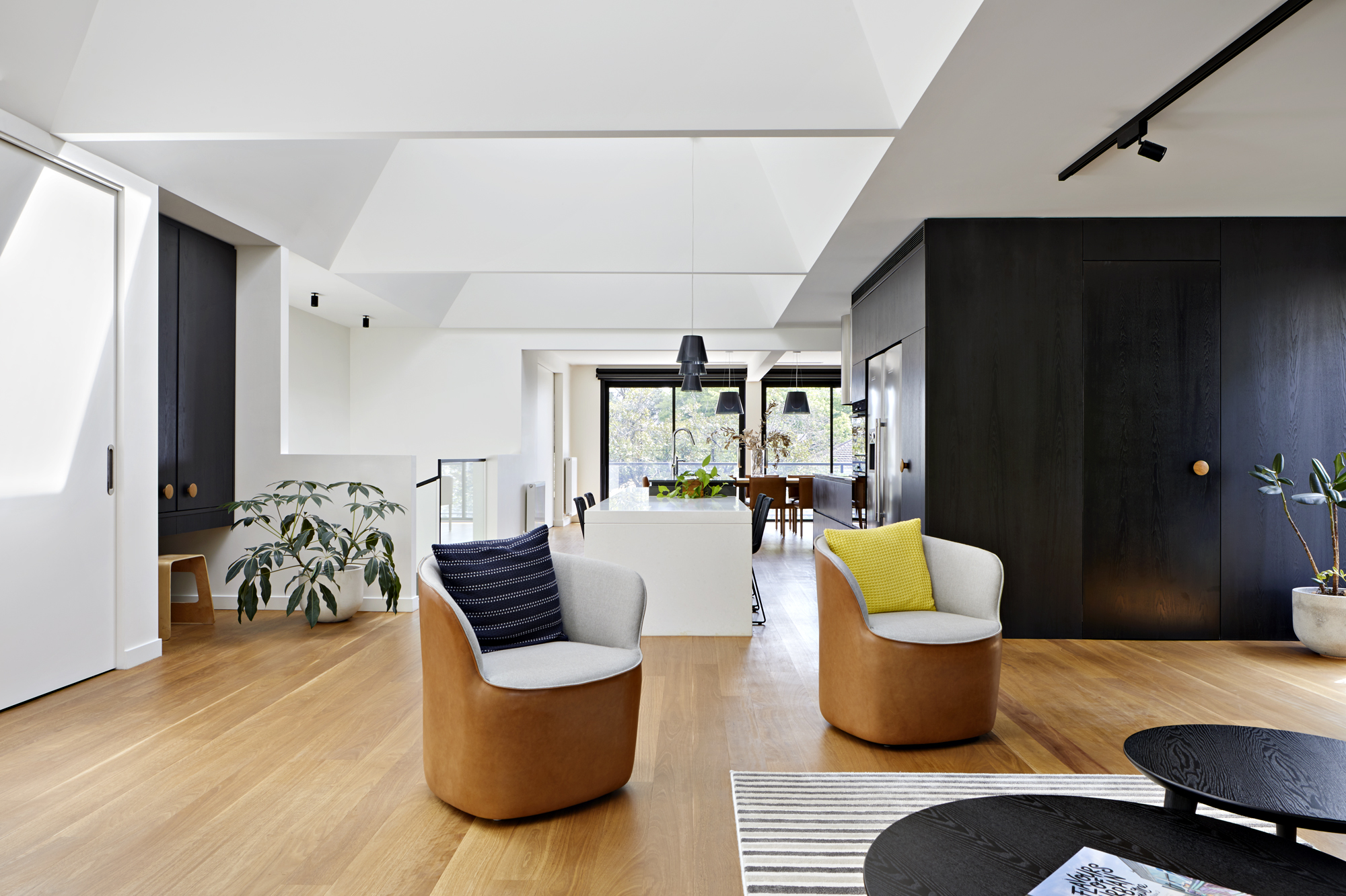
By swapping the living areas to the top floor and the bedrooms to the ground floor, we could achieve a layout that delivered far superior usable space for the family. It allowed the living areas to flow naturally onto the elevated backyard — with its refurbished swimming pool and new pavilion — and provided a greater sense of connection with the outdoors. This solution also minimised structural demand (and associated costs) as the open-plan nature of living spaces could be more easily accommodated on the upper floor.
"Our dream home materialised from the drawings and sketches. We were led through this process by Inbetween Architecture who showed boldness and courage to turn our house literally upside down."
/ vicky & ian — OWNERs /
Opening up to the sky
Finding more light
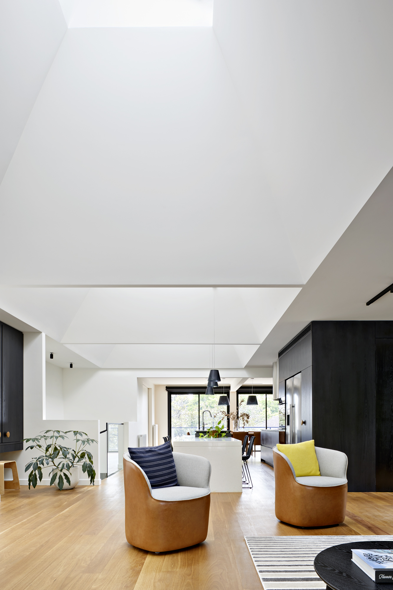
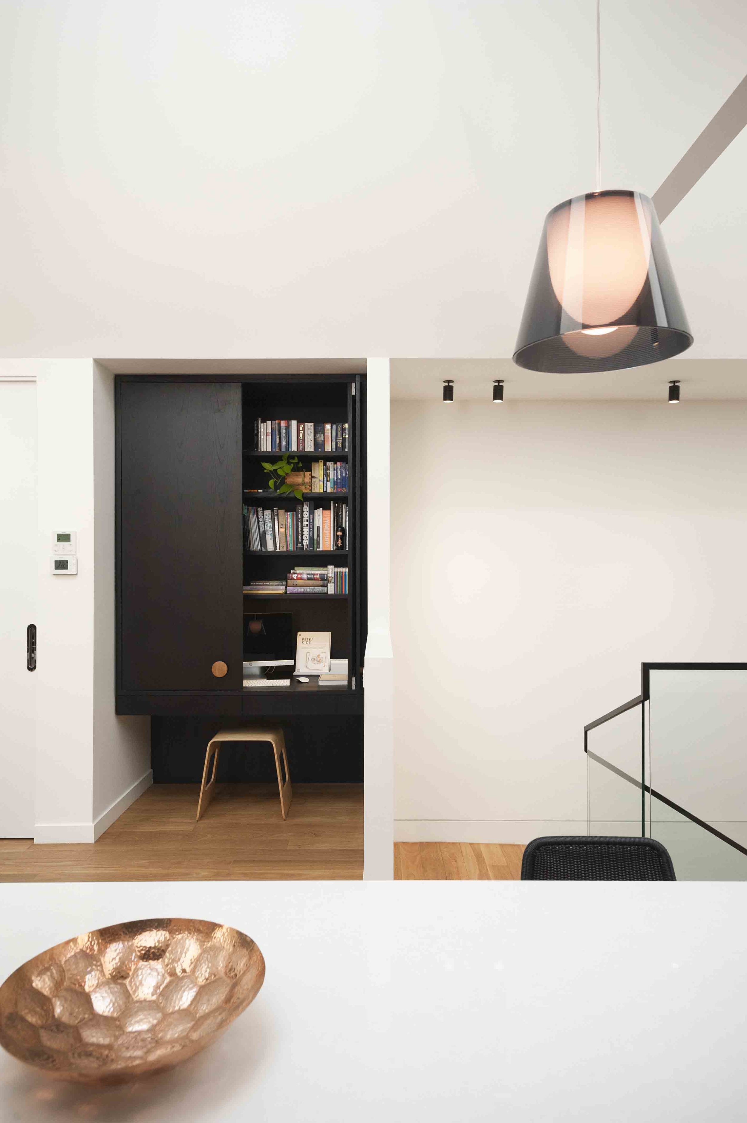
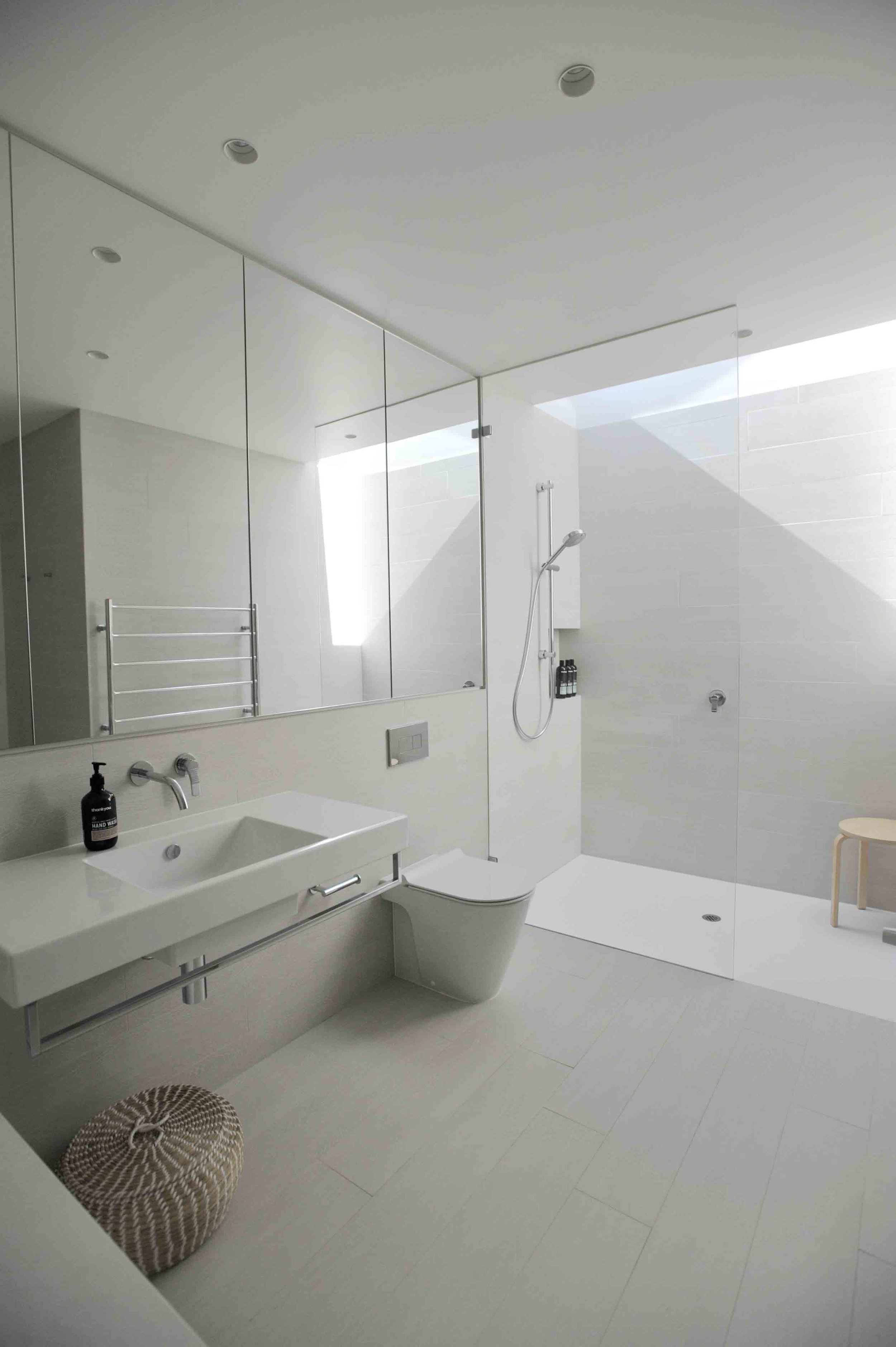
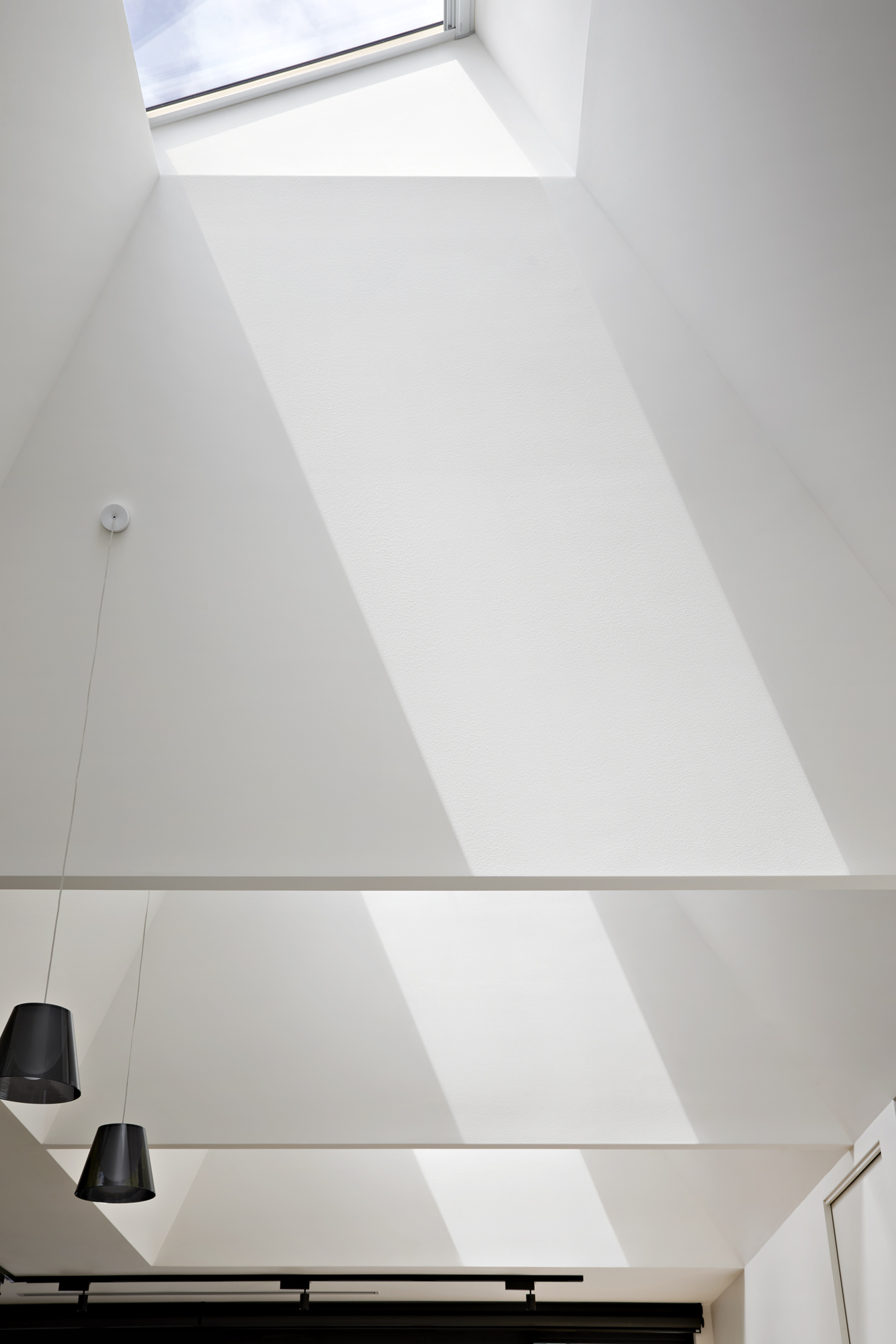
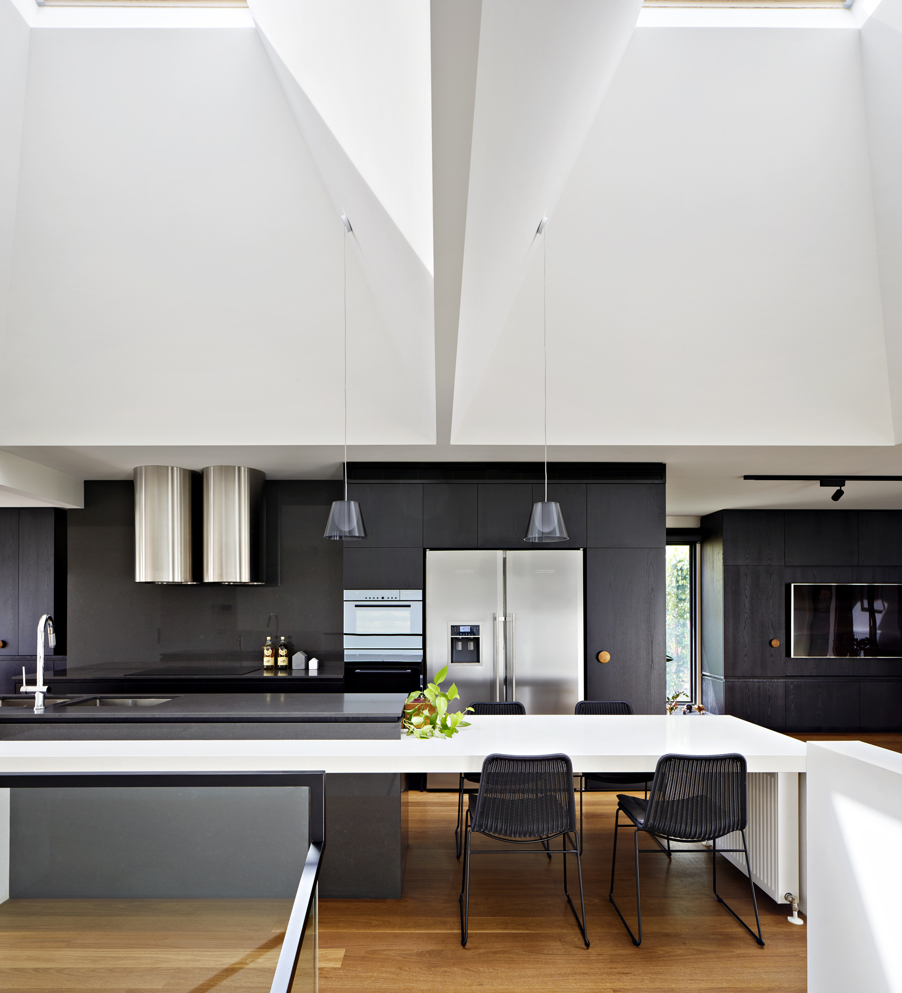
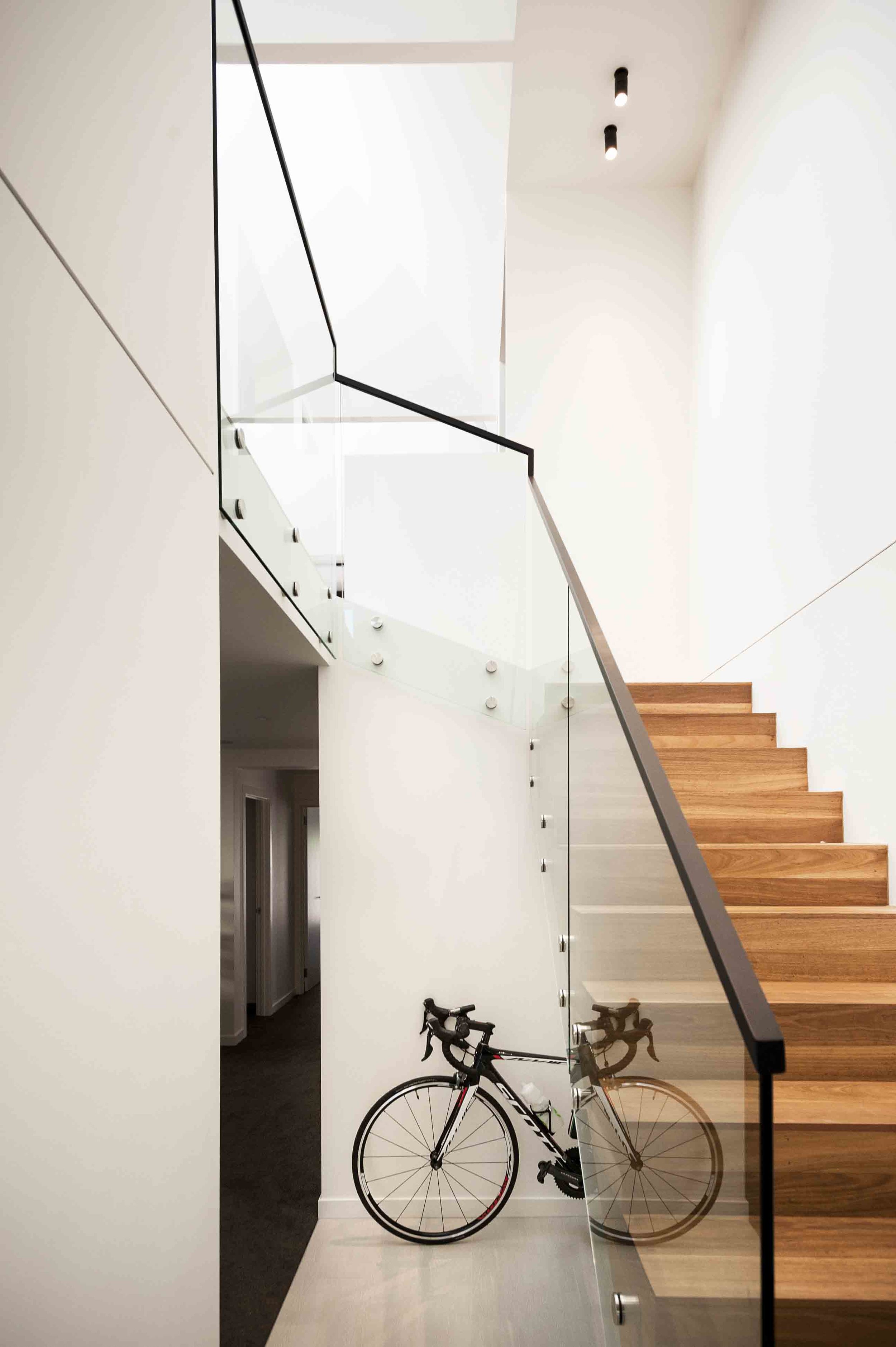
To deliver more light into the dark centre of the home, we devised an simple and cost-effective technique; standard-sized skylights combined with large tapered shafts. These flood the home with diffuse natural light all day long. The skylights are oriented to capture the morning sun, while the direct, harsher afternoon sun is avoided. The use of an enlarged stair void and glass balustrades also bring light deep into the heart of the lower level.
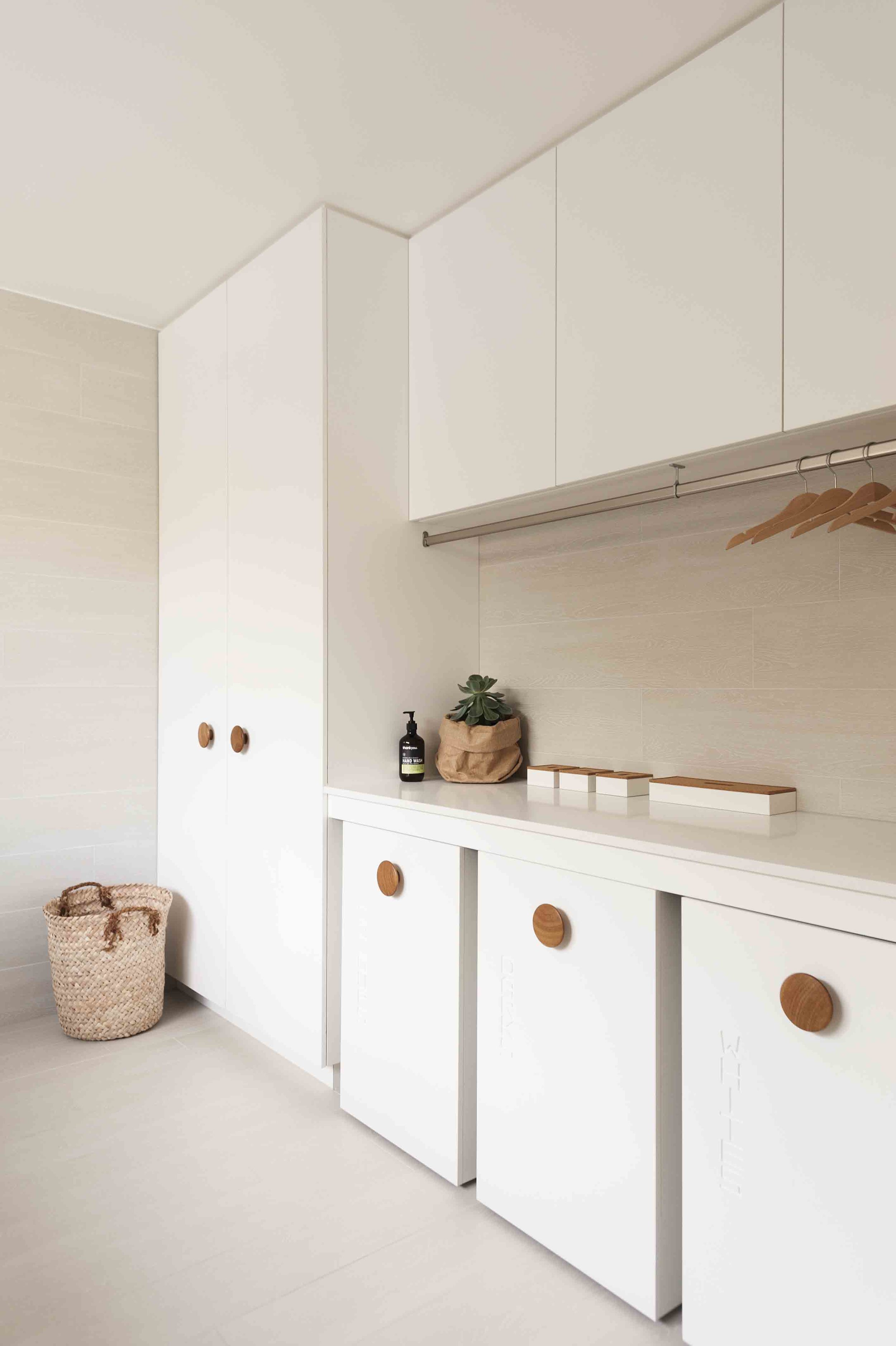
Working closely with the family and Interior Designer Aldona Pajdak, together we created a bold yet calming interior, with natural timbers to bring warmth and tactility. This high-contrast palette was made possible by the swathes of natural light, and provides an elegant and timeless interior.
High performance facelift
Never judGe a book by its cover
(but gosh, what a nice cover)
Externally, we were required to work within the existing envelope. The dark-brown brick was clad with insulating foam panels and rendered to update the appearance and vastly improve thermal performance. Black framed windows, new front and garage doors and landscaping completed the updated look.
Forever home.
There's no better brief than a home designed to last
We loved designing the Upside Down House, and finding ingenious solutions to complex challenges. With trusting homeowners and an amazing builder — with whom we continue to work — we have delivered not just a house, but a forever home for this family.

