PROJECT
Silhouette House
preston
Finalist 2024 ArchiTEAM Awards Residential Alterations & Additions $700k - $1.2M
The Challenge
The invisible extension
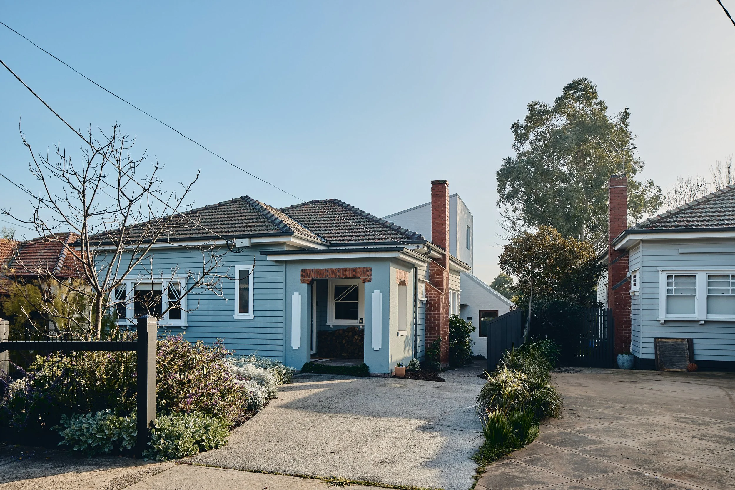
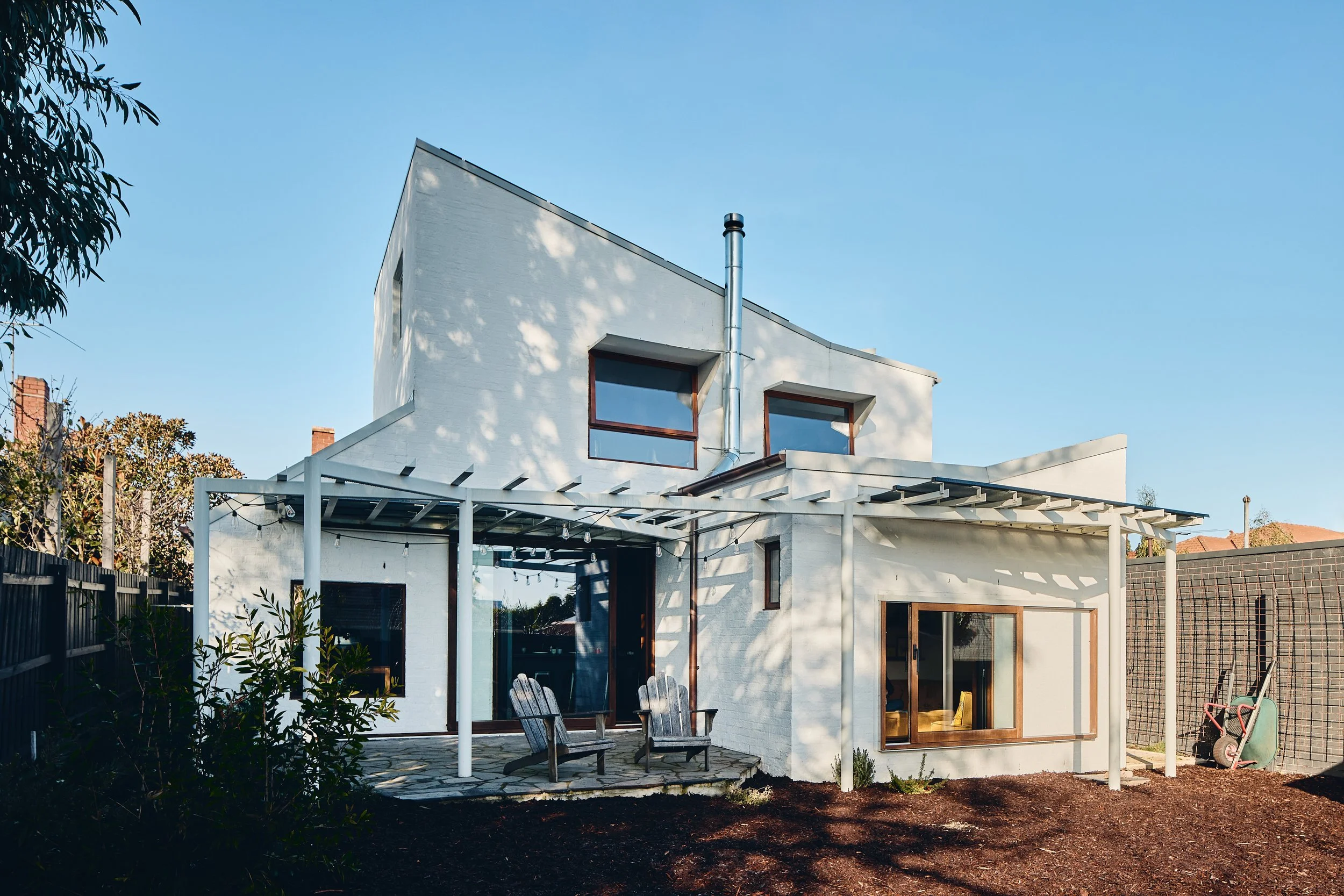
Silhouette House is a renovation and extension to a much-loved family home in Preston. The clients, a family of 5, had lived modestly (with the 3 kids sharing a small lean-to bedroom!) and were reluctant to overwhelm their charming cottage with a boxy, bulky extension, nor did they want to lose their north facing backyard. The home, however, needed to grow.
Accepting that a single-story addition would be too great a compromise to outdoor space, the challenge became ensuring that the extension would allow the original house to retain its integrity, contribute respectfully to the context and character of its northern suburbs locality while providing a warm and welcoming contemporary home, befitting of its family.
What if …
…Recognising the strengths of the existing can inform and shape the new?
As is often the case, the existing house consisted of several enclosed rooms opening from a central hallway, with limited natural light and poor connection to the rear. The site had a gentle fall from front to back, leaving the north facing rear of the house elevated, further reducing the opportunity for meaningful connection to the backyard. While these aspects were seen as detractors of the existing house, they became drivers and ultimately strengths of the new design.
The existing layout leant itself to accommodating contained spaces, such as bedrooms and bathrooms, which didn’t demand all-day access to natural light or direct outdoor connection. This approach allowed the best ‘bang for buck’ for the existing floor area and created a clear zoning distinction between the original and the new parts of the house. The extension was set down, to match the fall of the site. This allowed direct outdoor access from the new lower ground floor but also minimised the height relative to the existing home, and thus the visual impact of the upper level from the street.
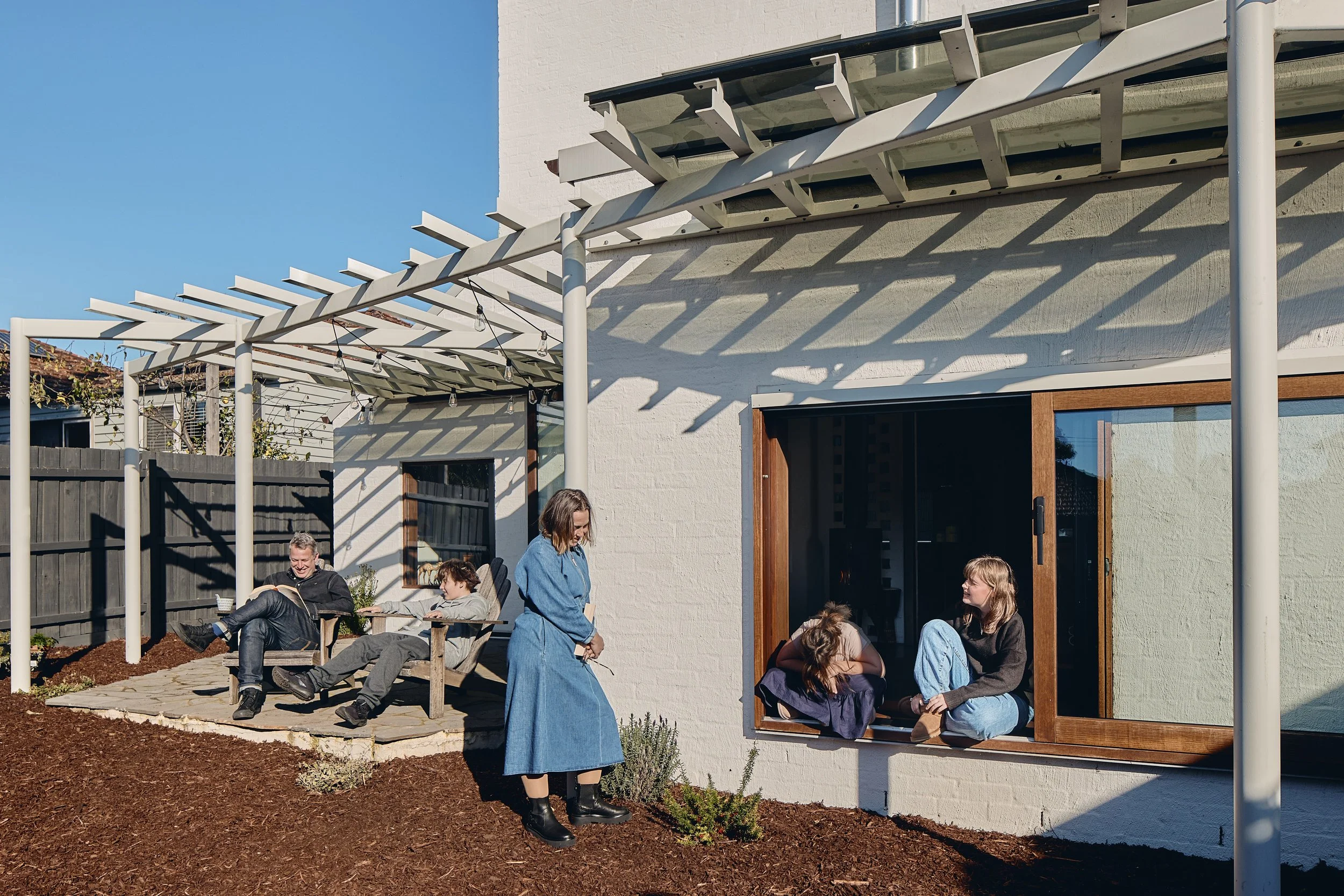
The extension provides stark contrast to the original house yet is designed to respond to the immediate and greater suburban context. The kinked rooflines allude to a familiar silhouette, with their cue taken from the saw-toothed profile of nearby factories and warehouses, while the pergola is a reinterpretation of the aussie backyard hero, the Hills hoist clothesline.
Prioritising family living
consolidated living zones
There is temptation when undertaking a large-scale renovation / extension to fall into the should trap. For example, first floor kids’ zone should have its own bathroom, a master bedroom should have an ensuite etc. With this home, the clients were very clear on their needs and priorities – so long as there were enough bedrooms and bathrooms to go around, they did not have to be ensuited, or co-located at the expense (spatial and financial) of having to double up or compromise elsewhere.
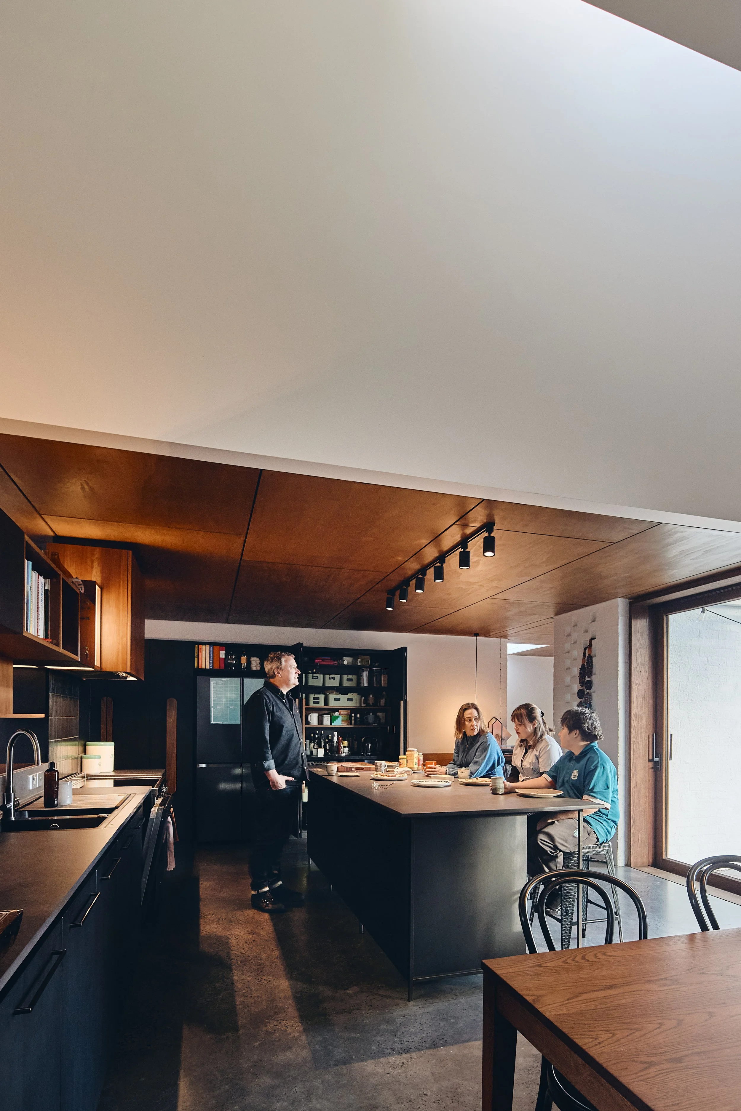
Elsewhere, in this case, being the spaces where the family would come together, often with extended family and friends, and spend most of their time. The hub of this home is the expansive family kitchen, the anchor to the adjacent living zones including dining, outdoor entertaining and the playful sunken ‘conversation pit’-style lounge.
This zone is conceived as a series of living spaces, acknowledging that much of the family togetherness revolves around the kitchen. The generous island bench allows meal preparation, informal eating, socialising and homework or other activities. A study nook adds further functionality to this space. Adjacent is the dining table, ready for working from home or feeding a family of 5 (or 10). The glass sliding door slides out of view connecting to the outdoor living area so that it spills from the kitchen, creating an expanded entertaining zone. Slightly secluded, with filtered views back to the kitchen, is the sunken lounge. With built-in seating, sky-lighting and limited but curated views to the garden, this space creates a more intimate and snug atmosphere within the larger living zone.
Who needs a front door anyway?
sorry delivery person!
With the bedroom zone being allocated to the original house, the issue arose that on entering the house from the front door, visitors had to walk through the ‘private zone’ to reach the shared living spaces. Similarly, the main living spaces being removed from the entry meant poor vision over comings and goings.
The solution was to introduce a secondary entry that immediately brings visitors (and family!) to the hub of the home. Centrally located, this also created an opportunity to clearly express the meeting point of the old and new parts of the house with a light filled, glass roofed link. As the daily entry point for the busy family, it also solved the typical front door ‘dumping ground’ issue, by providing considered storage for shoes, bags, coats and an ‘out of sight out of mind’ home for all the tech!
Not so clear cut
celebrating the transition
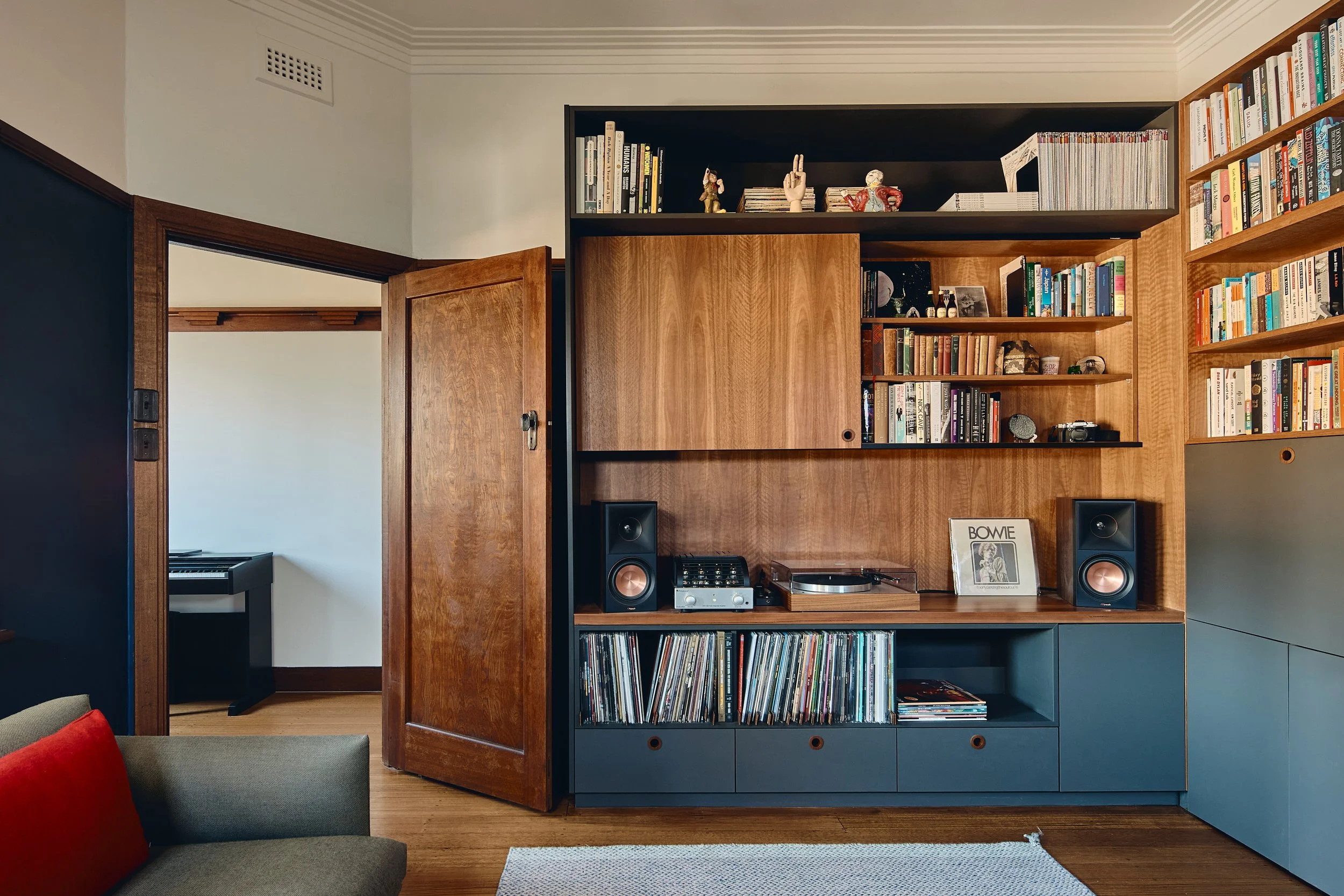
While the zoning strategy was clear cut - bedrooms in or accessed from the original house and new living spaces to the rear extension - we didn’t want the home to feel disjointed. A striking feature of the original home were the timber accents. The picture rails and decorative plate shelves created a focus in the hallway while the beautiful veneer panels of the room and cupboard doors added such warmth and visual texture.
We decided that instead of their being a clear old house / new house divide, we would use the staircase to create a transition zone. As such, the split-flight staircase was located within the footprint of the original house with a half flight down to the new lower ground floor and a half flight up to the new bedrooms. While this added complexity to the build, it meant that this stair could become an anchor point, appreciated from both halves, and both levels of the home.
Extending both upward to the first floor and down to the new lower level, this vertical, trunk-like element creates a continuous connection linking the upper, middle and lower parts of the house. The timber lining boards concealing cupboard doors and feature lighting alike. From the original hall, the new timber lining sits harmoniously with the original timber details and is then referenced in the extension through select timber joinery and hardware. The open decking to the first-floor landing is evocative of a tree house platform, with visual connection to the level below and windows in every direction for canopy views.


