PROJECTS
Woori
Toorak
The Challenge
give an old beauty a new lease of life
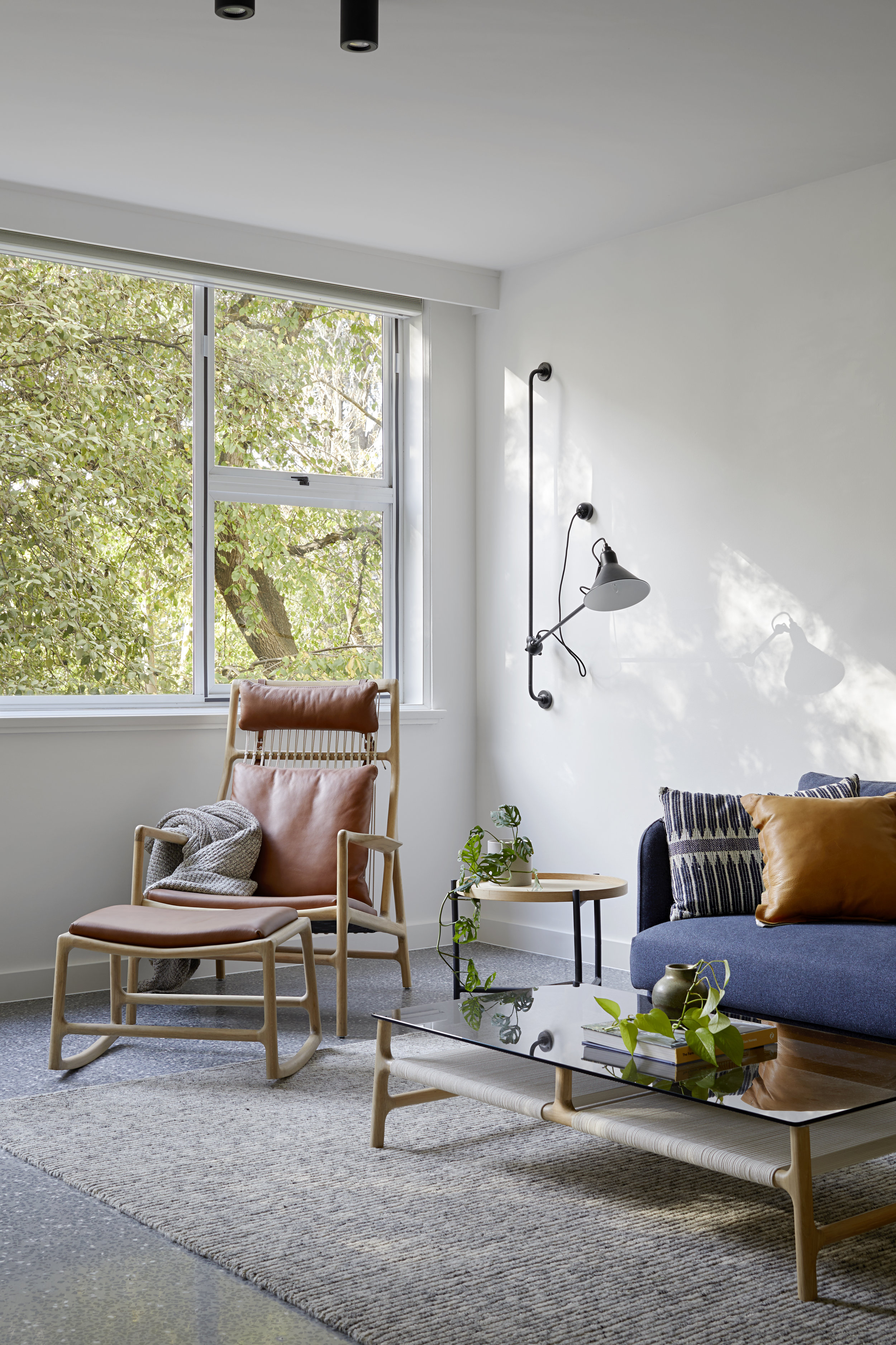
Located on the first floor of a 1960s apartment building in the leafy Melbourne suburb of Toorak, this apartment has canopy views and a sense of privacy rarely found in such a location. The rooms are generous, but the 1980s renovation was looking tired. The living space felt internalised despite the garden outlook and north facing position, and the floor plan was not conducive to today's contemporary open-plan living.
What if...
the cosmetic upgrade went a little bit further ...
Tasked with giving the apartment a ‘refresh’, we challenged the client to also consider giving the floor plan a few tweaks; a dressed up 1960s floor plan is still a 1960s floor plan. The original kitchen with adjoining meals area, while large, was completely separated from the dining and living rooms and the access to the balcony was awkwardly tucked away in a corner of the living room.
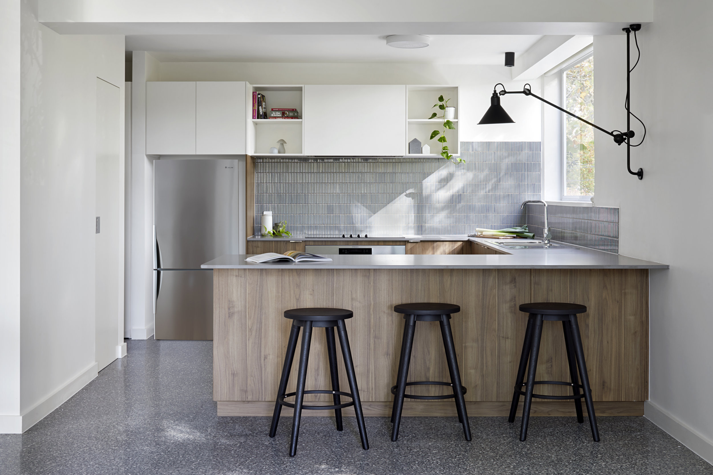
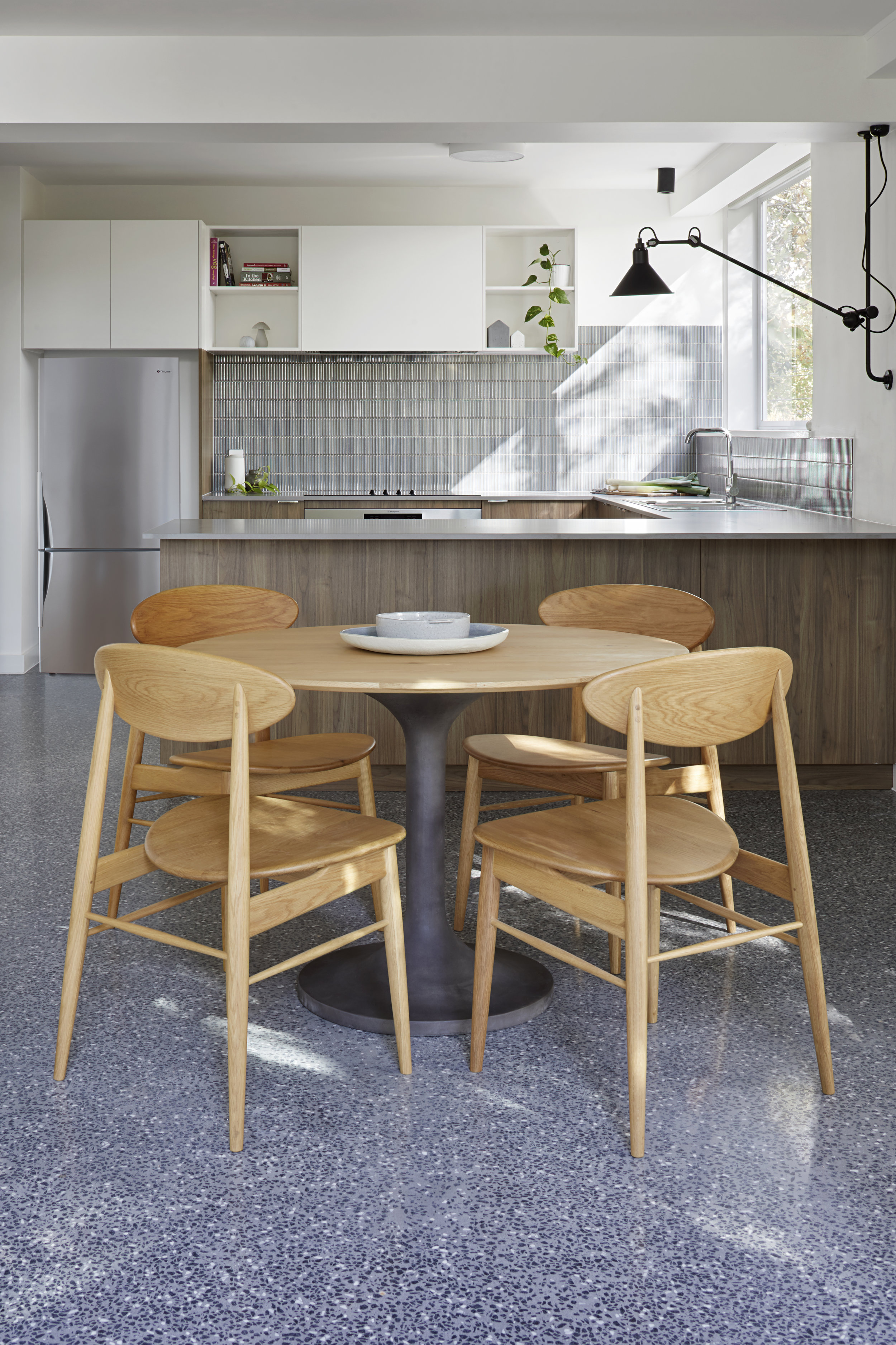
The biggest alteration was removing the wall between the kitchen and dining rooms to create open-plan kitchen / dining and give the kitchen a view to the garden. The meals area was reconfigured to create a walk-in pantry with casual meals catered for at the new island bench.
Refresh
peeling back and starting over
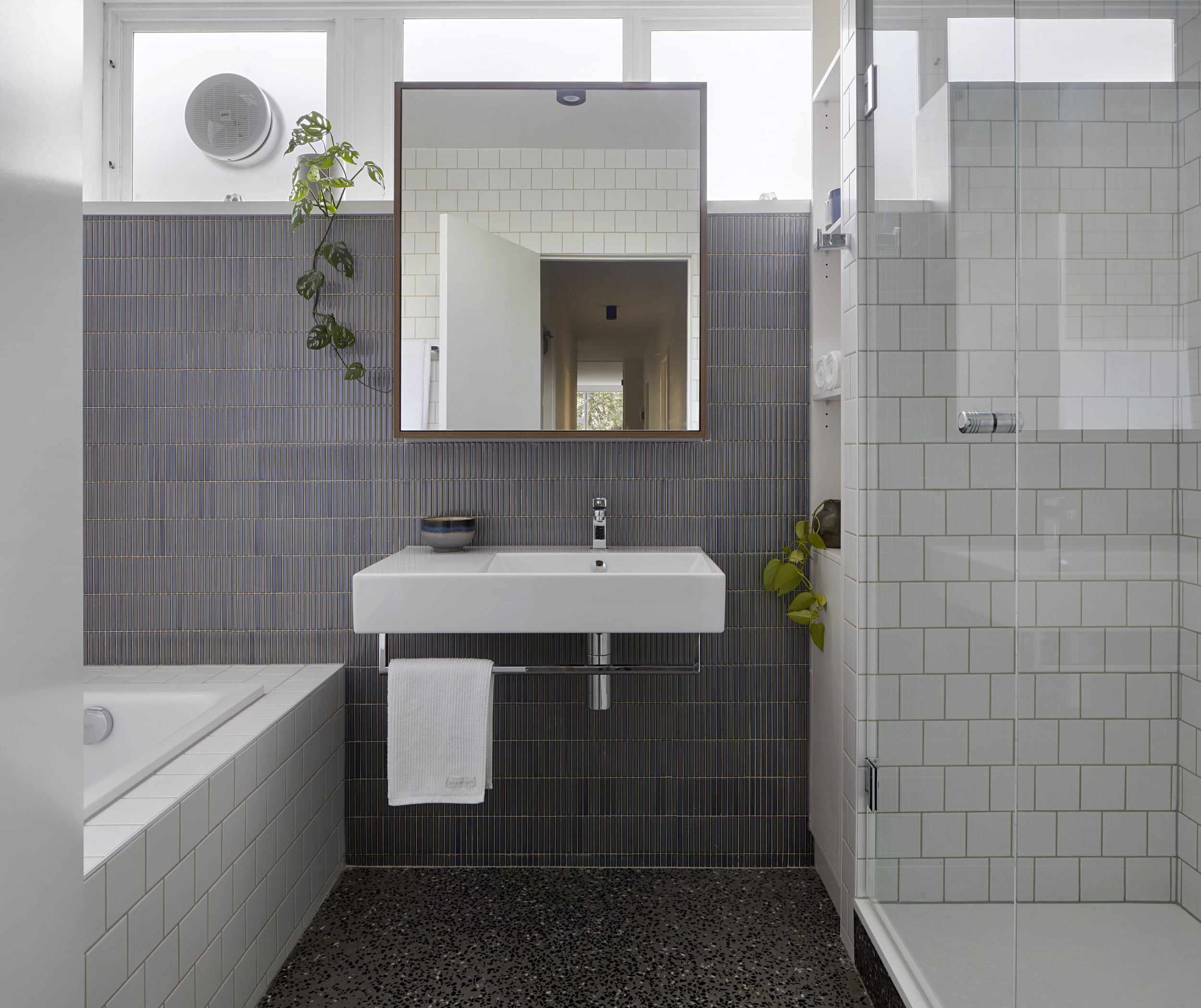
At the heart of this project was the need to give the apartment a cosmetic refresh. There were some oddities from the previous renovation, but the bones were always good. The approach was to simplify and streamline, to create a feeling of freshness, openness and light. We worked within the existing constraints, such as layout of wet areas and locations of existing fixtures, but dramatically updated the look through a coordinated and refined selection of new fixtures and finishes. By making small tweaks, we were able to improve the functionality of the spaces within their existing general layouts.
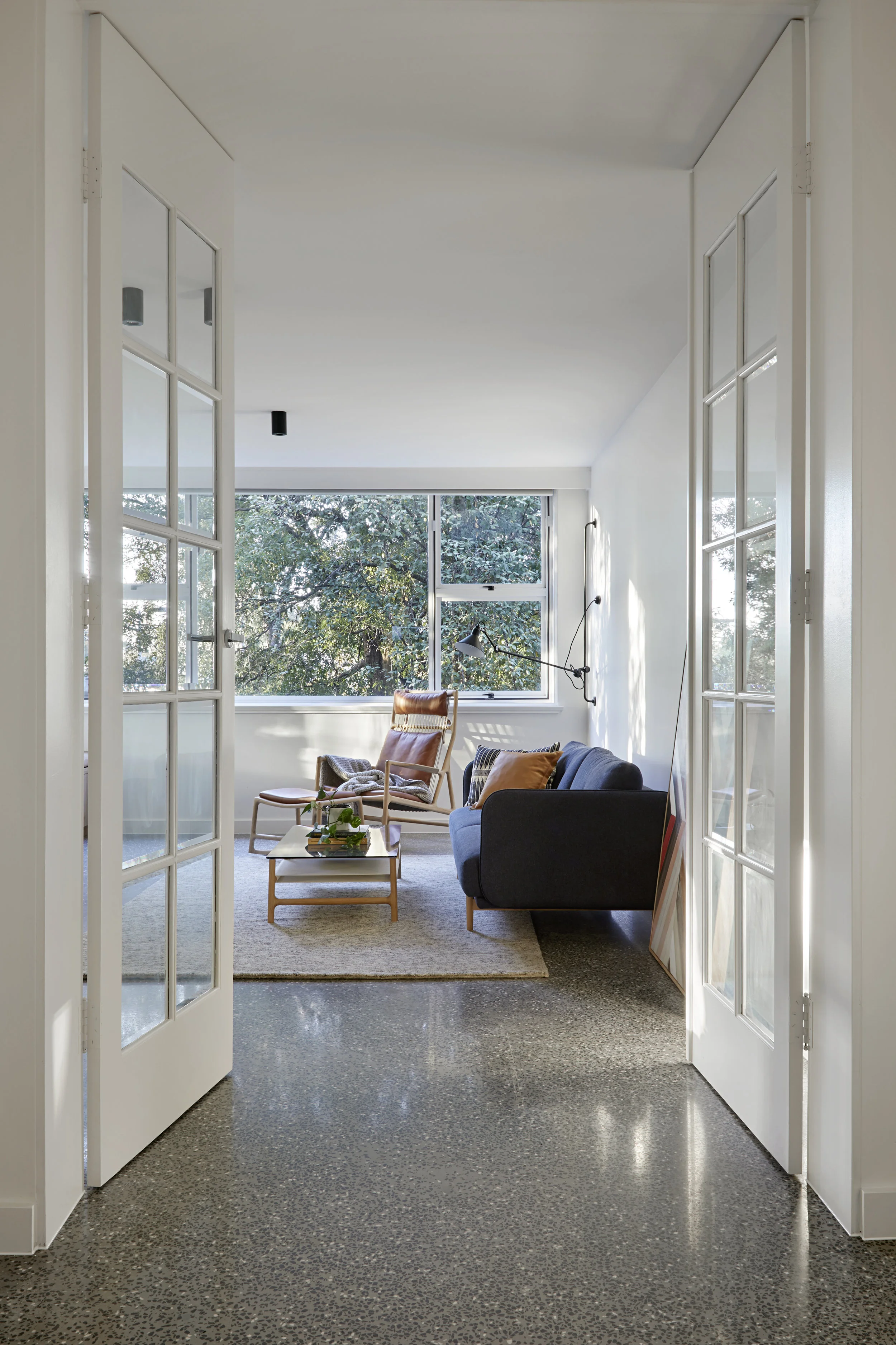
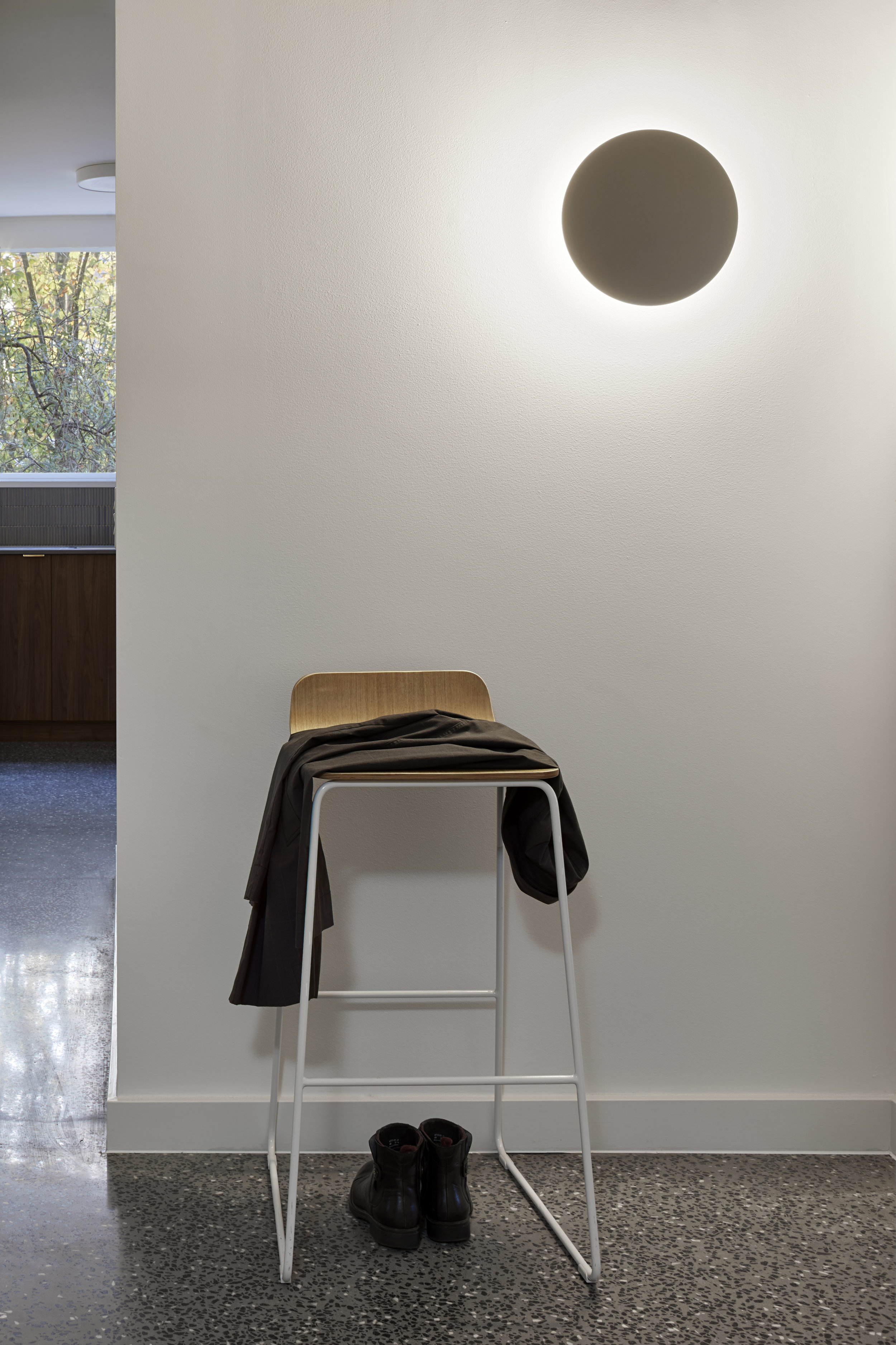
Approaching the project with a consistent material and colour palette provides continuity throughout the apartment. Working with a limited base palette reduces the visual clutter and allows the selected features to stand out against a more subdued backdrop.
Quiet comforts
finding a moment to enjoy
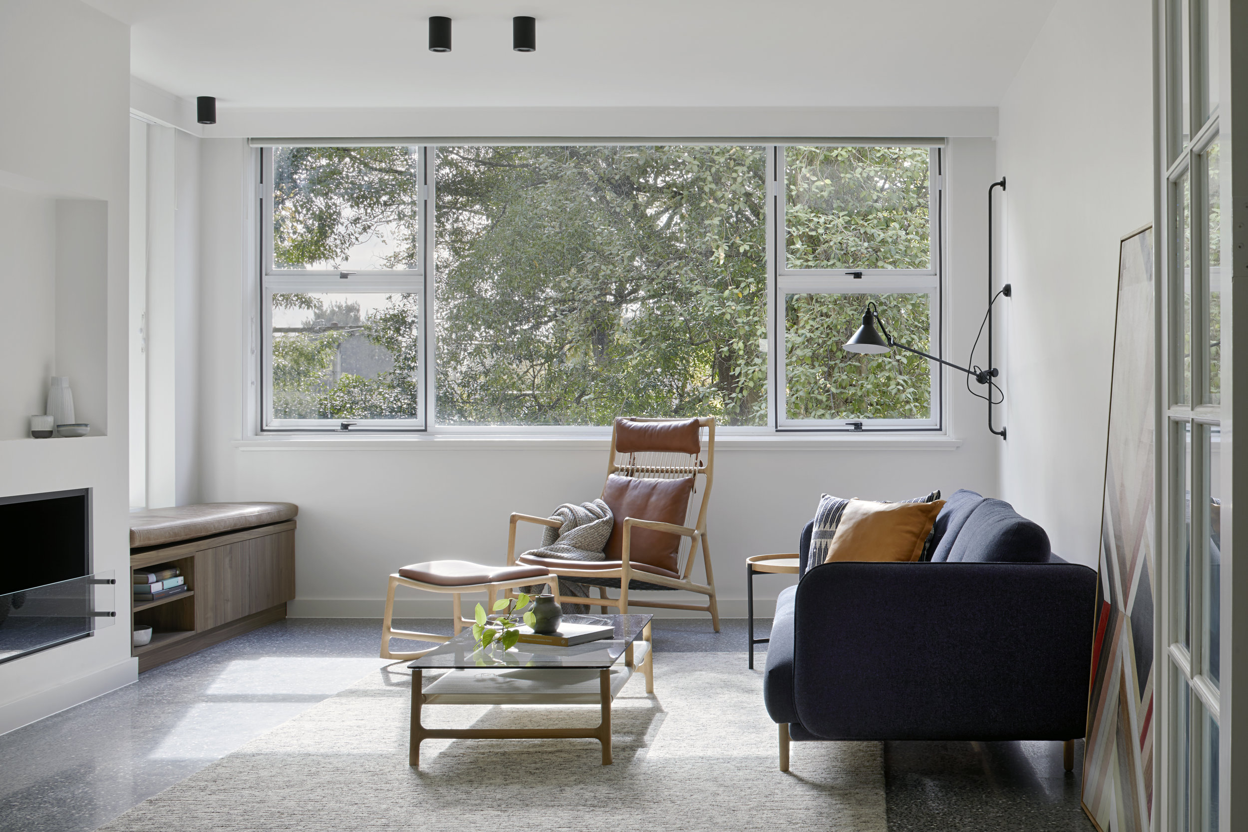
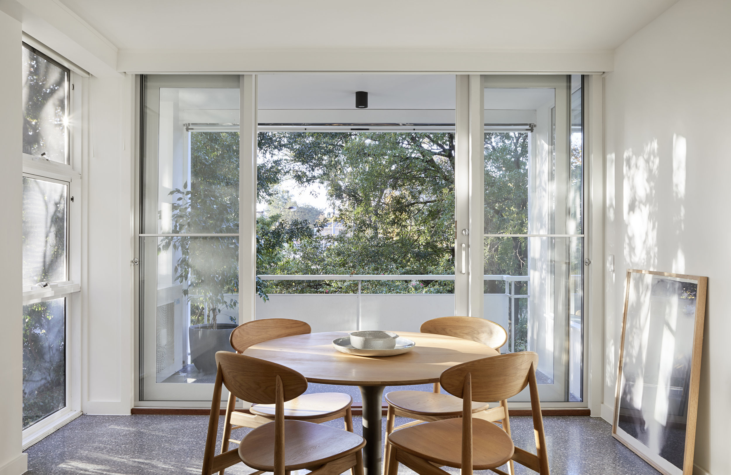
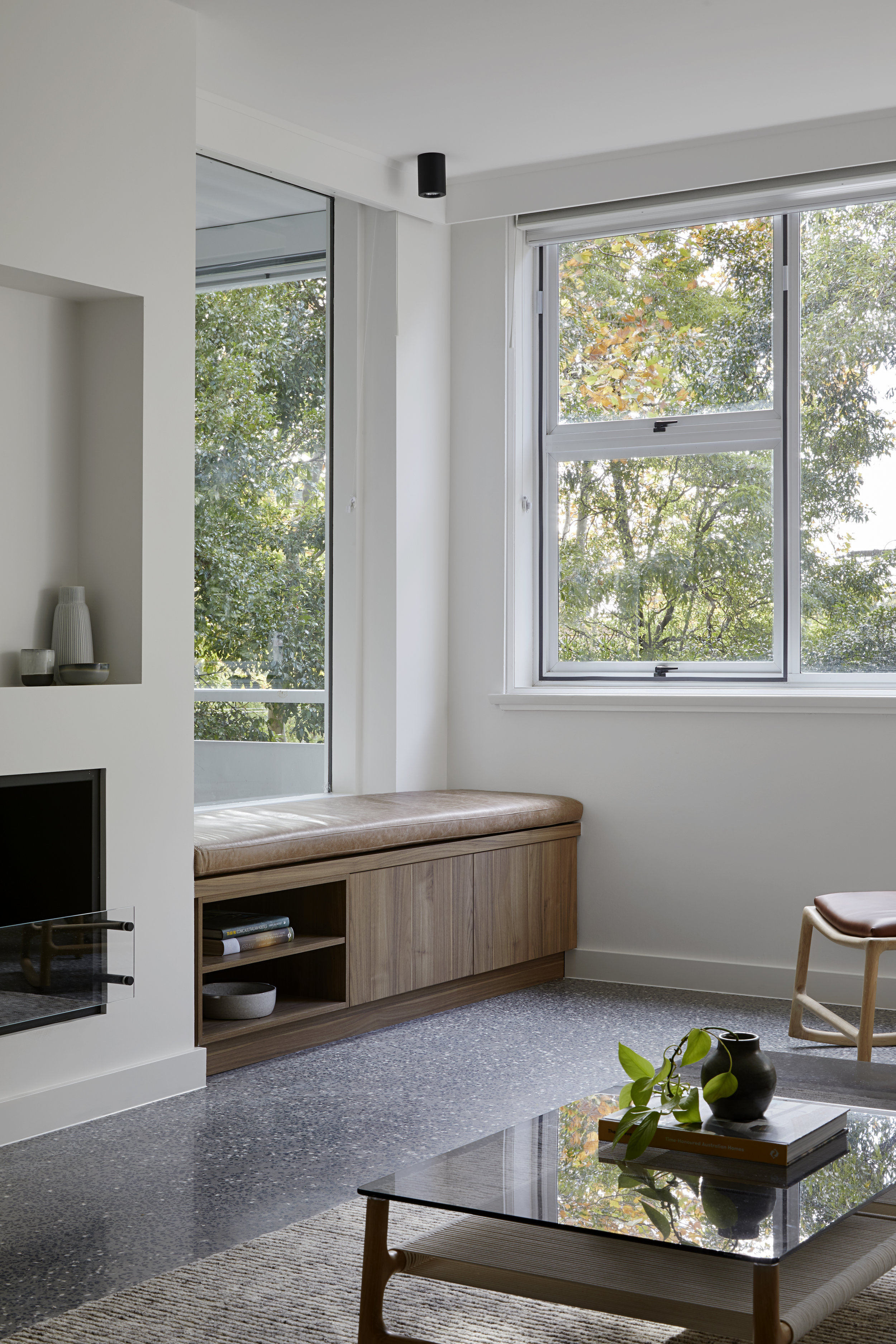
Relocating the access to the balcony from the living room to the dining area opened up the opportunity to create a more cozy, comfortable living space. A new bench seat, where the old door used to be, creates a casual space to enjoy the sunshine and view, and a new fireplace gives the room a focus and adds a homely quality to the living space.

